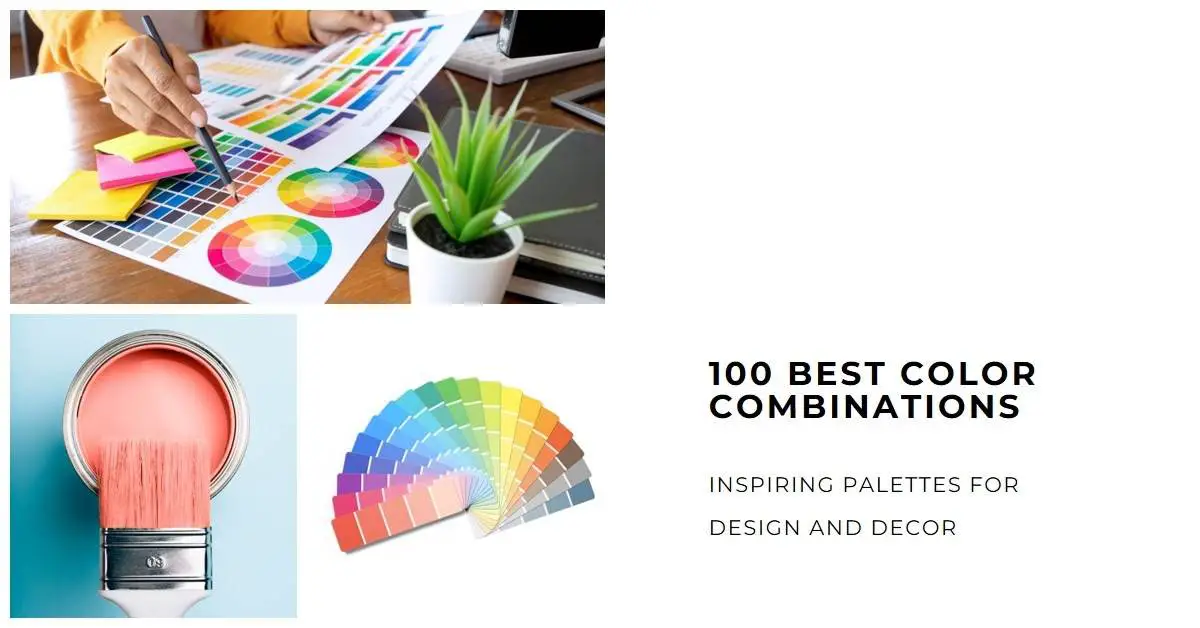
Colors play a vital role in our lives, influencing our emotions, perceptions, and overall well-being. Whether you’re designing a website, creating a logo, or decorating your home, choosing the right color combinations can make a significant impact.
In this article, we will explore the 100 best color combinations that will inspire you and enhance your design projects.
From timeless classics to unique and bold choices, these palettes offer endless possibilities to unleash your creativity.
1. Mustard Yellow and Gray
Mustard yellow and gray is a striking color combination that blends warmth and sophistication. Mustard yellow, reminiscent of autumn leaves, adds a vibrant and energetic touch, while gray brings a sense of calm and balance. This palette is versatile and can be used in various design contexts, from interior decor to graphic design.
Applications
Interior Design
In interior design, the mustard yellow and gray combination can transform a space from ordinary to extraordinary. Picture a cozy living room with mustard yellow accent pillows and a gray sofa. The yellow adds a pop of color, creating a focal point, while the gray provides a neutral backdrop, allowing other elements in the room to shine.
Graphic Design
Graphic designers can leverage this color duo to create attention-grabbing designs. A poster with a mustard yellow background and gray typography can convey a sense of energy and elegance. The contrast between the two colors adds visual interest and ensures legibility.
Color Psychology
Mustard yellow is associated with happiness, optimism, and creativity. It can evoke feelings of warmth and joy, making it an excellent choice for designs that aim to uplift the viewer’s mood.
Gray, on the other hand, represents neutrality, sophistication, and balance. It has a calming effect and can lend an air of elegance and timelessness to any composition.
Complementary Colors
To enhance the mustard yellow and gray combination, consider incorporating complementary colors such as deep navy blue or rich burgundy. These hues create a harmonious interplay, balancing the warmth and coolness of the palette.
Mustard yellow and gray form a dynamic color duo that brings energy and sophistication to various design projects. Whether you’re redecorating your home or working on a graphic design project, this combination offers a captivating visual experience. Experiment with different shades and intensities to create your unique expression of this timeless palette.
2. Coral and Teal
Coral and teal combine to create a vibrant and energetic color pairing that evokes a sense of tropical paradise. Coral, with its warm undertones, represents enthusiasm and playfulness, while teal, reminiscent of ocean waters, brings a refreshing and calming presence. This dynamic duo is perfect for designs that aim to make a bold statement.
Applications
Fashion Design
Coral and teal are popular choices in fashion design, particularly for summer collections and beachwear. Picture a flowing coral dress adorned with teal accessories such as earrings or a statement necklace. The combination exudes a sense of vitality and captures the essence of a sunny day at the beach.
Website Design
Website designers can leverage the coral and teal palette to create visually engaging and modern interfaces. A coral navigation bar with teal buttons and accents can add a touch of excitement to an otherwise minimalist design. The colors work harmoniously to guide the user’s attention and create a memorable browsing experience.
Color Psychology
Coral represents enthusiasm, creativity, and warmth. It stimulates the senses and can evoke feelings of joy and excitement. Teal, on the other hand, symbolizes calmness, balance, and clarity. It has a soothing effect and can promote a sense of relaxation and serenity.
Complementary Colors
To amplify the impact of coral and teal, consider incorporating complementary colors such as gold or navy blue. These hues add depth and richness to the palette, creating a visually captivating composition.
Coral and teal come together to form a lively and invigorating color combination that radiates positivity and adventure. Whether you’re designing a fashion collection or crafting a website, this palette offers endless possibilities to create eye-catching and memorable experiences. Embrace the vibrancy of coral and the serenity of teal to infuse your designs with a touch of tropical charm.
3. Mint Green and Navy Blue
Mint green and navy blue combine to create a sophisticated and timeless color pairing. Mint green, reminiscent of fresh spring leaves, exudes a sense of tranquility and rejuvenation.
Navy blue, a classic hue, brings depth and elegance to the palette. This combination is ideal for designs that seek a harmonious balance between serenity and sophistication.
Applications
Wedding Decor
Mint green and navy blue are a popular choice for wedding decor, particularly for outdoor or springtime ceremonies. Imagine mint green tablecloths adorned with navy blue floral centerpieces.
The delicate balance between the softness of mint green and the richness of navy blue creates an atmosphere of elegance and refinement.
Branding
Brands looking to convey a sense of freshness and reliability can utilize the mint green and navy blue combination in their logo and branding materials. The mint green evokes a feeling of growth and renewal, while the navy blue adds a touch of trust and professionalism. Together, they create a visually appealing representation of the brand’s values.
Color Psychology
Mint green is associated with tranquility, renewal, and harmony. It has a calming effect and can evoke feelings of relaxation and balance. Navy blue, on the other hand, symbolizes stability, trust, and depth. It exudes a sense of confidence and can lend a touch of sophistication to any design.
Complementary Colors
To enhance the mint green and navy blue combination, consider incorporating complementary colors such as blush pink or gold. These hues add warmth and delicacy, creating a visually captivating contrast with the coolness of the palette.
Mint green and navy blue offer a refined and timeless color combination that brings a sense of tranquility and elegance to any design project.
Whether you’re planning a wedding or building a brand identity, this palette provides a harmonious blend of serenity and sophistication.
Embrace the freshness of mint green and the depth of navy blue to create designs that exude a timeless beauty.
4. Lavender and Mint Green
Lavender and mint green come together to create a soft and refreshing color combination. Lavender, with its delicate purple tones, exudes a sense of tranquility and grace. Mint green, reminiscent of mint leaves, adds a touch of coolness and vitality. This pairing is perfect for designs that seek a balance between serenity and freshness.
Applications
Interior Decor
Lavender and mint green can transform any space into a peaceful oasis. Imagine a bedroom adorned with lavender walls and mint green accents, such as throw pillows or curtains. The combination of these gentle hues creates an atmosphere of relaxation and serenity, making it an ideal color scheme for bedrooms or meditation rooms.
Wedding Invitations
For couples seeking a romantic and whimsical theme for their wedding, lavender and mint green make a delightful choice. Invitations featuring lavender backgrounds with mint green floral motifs or accents can set the tone for a dreamy and enchanting celebration. The softness of lavender and the freshness of mint green create a captivating invitation suite.
Color Psychology
Lavender is associated with serenity, spirituality, and grace. It has a calming effect and can promote feelings of peace and harmony. Mint green, on the other hand, symbolizes freshness, growth, and renewal. It brings a sense of vitality and rejuvenation to any composition.
Complementary Colors
To enhance the lavender and mint green combination, consider incorporating complementary colors such as blush pink or silver. These hues add a touch of elegance and sophistication, creating a visually pleasing contrast with the softness of the palette.
Lavender and mint green offer a delicate and refreshing color combination that brings a sense of tranquility and vitality to any design. Whether you’re decorating a space or creating wedding invitations, this palette evokes a serene and enchanting atmosphere. Embrace the grace of lavender and the freshness of mint green to craft designs that exude beauty and tranquility.
5. Blush and Teal
Blush and teal form a captivating color combination that balances femininity with vibrancy. Blush, with its soft and delicate pink undertones, adds a touch of elegance and romance. Teal, a rich shade of blue-green, brings a bold and energetic presence. Together, they create a striking palette that is both visually appealing and versatile.
Applications
Fashion Design
Blush and teal are popular choices in fashion design, particularly for formalwear and evening gowns. Imagine a blush-colored dress with teal accents, such as a teal belt or statement jewelry. The combination of these colors adds depth and sophistication to the overall look, making it perfect for special occasions.
Home Accessories
In-home decor, blush, and teal can be incorporated through various accessories to create an inviting and stylish ambiance. Picture a living room with blush-colored curtains and teal throw pillows. The contrast between the softness of blush and the vibrancy of teal adds visual interest and creates a harmonious atmosphere.
Color Psychology
Blush is often associated with romance, femininity, and tenderness. It has a soothing effect and can evoke feelings of warmth and comfort. Teal, on the other hand, symbolizes creativity, energy, and balance. It brings a sense of vitality and can add a touch of excitement to any design.
Complementary Colors
To enhance the blush and teal combination, consider incorporating complementary colors such as gold or ivory. These hues add a touch of luxury and sophistication, creating a visually pleasing contrast with the softness and vibrancy of the palette.
Blush and teal create a captivating color pairing that blends femininity and vibrancy. Whether you’re designing fashion pieces or styling your home, this palette offers endless possibilities to create visually appealing and harmonious compositions. Embrace the elegance of blush and the energy of teal to add a touch of sophistication to your designs and create a lasting impression.
6. Turquoise and Mint Green
Turquoise and mint green come together to create a refreshing and invigorating color combination. Turquoise, with its vibrant blue-green tones, evokes the image of tropical waters and sunny skies. Mint green, reminiscent of fresh mint leaves, adds a cool and soothing element. This pairing is perfect for designs that aim to create a sense of tranquility and natural beauty.
Applications
Beach-themed Designs
Turquoise and mint green are often used in beach-themed designs to capture the essence of a tropical paradise. Imagine a beach towel with a turquoise and mint green striped pattern, or a coastal-inspired bedroom with turquoise walls and mint green accents. This color combination instantly transports us to the calm and serene ambiance of the seaside.
Nature-inspired Artwork
The combination of turquoise and mint green is also well-suited for nature-inspired artwork. From landscapes to botanical illustrations, these colors can bring a sense of freshness and vibrancy to the artwork. Consider using them in paintings, prints, or digital designs that aim to celebrate the beauty of the natural world.
Read Also:
DIY Wall Painting Design Ideas: Tips to Transform Space
Color Psychology
Turquoise is associated with calmness, clarity, and open communication. It has a soothing effect and can evoke feelings of tranquility and relaxation. Mint green, on the other hand, symbolizes freshness, renewal, and growth. It brings a sense of vitality and rejuvenation, reminiscent of the beauty of nature.
Complementary Colors
To enhance the turquoise and mint green combination, consider incorporating complementary colors such as coral or sandy beige. These warm hues create a striking contrast and add depth to the palette, representing the colors often found in coastal landscapes.
Turquoise and mint green offer a refreshing and invigorating color combination that brings a sense of tranquility and natural beauty to any design. Whether you’re creating beach-themed designs or nature-inspired artwork, this palette allows you to capture the essence of calmness and vibrancy. Embrace the soothing allure of turquoise and the refreshing quality of mint green to create designs that transport viewers to a serene and natural world.
7. Navy Blue and Peach
Navy blue and peach come together to create a sophisticated and warm color combination. Navy blue, a deep and rich hue, exudes a sense of elegance and authority. Peach, with its soft and delicate orange tones, adds a touch of warmth and playfulness. This pairing is perfect for designs that aim to strike a balance between sophistication and approachability.
Applications
Event Invitations
Navy blue and peach make a beautiful choice for event invitations, particularly for formal or elegant gatherings. Imagine a navy blue background with peach accents and delicate floral motifs. The contrast between the deepness of navy blue and the softness of peach creates an invitation that is both captivating and inviting.
Home Decor
In home decor, navy blue and peach can be incorporated through various elements to create a refined and cozy ambiance. Picture a living room with navy blue walls and peach-colored throw blankets or pillows. The combination of these colors adds depth and warmth, making the space feel both luxurious and inviting.
Color Psychology
Navy blue is often associated with stability, trust, and professionalism. It has a calming effect and can evoke feelings of reliability and confidence. Peach, on the other hand, symbolizes friendliness, joy, and playfulness. It brings a sense of approachability and can add a touch of liveliness to any design.
Complementary Colors
To enhance the navy blue and peach combination, consider incorporating complementary colors such as gold or ivory. These warm hues add a touch of elegance and sophistication, creating a visually pleasing contrast with the depth and softness of the palette.
Navy blue and peach create a sophisticated and warm color pairing that strikes a balance between elegance and approachability. Whether you’re designing event invitations or styling your home, this palette offers a timeless and inviting aesthetic. Embrace the authority of navy blue and the playfulness of peach to create designs that exude both refinement and warmth.
8. Peach and Teal
Peach and teal combine to create a harmonious and refreshing color combination. Peach, with its soft and warm undertones, exudes a sense of gentleness and warmth. Teal, a vibrant shade of blue-green, brings a lively and invigorating presence. Together, they create a palette that is both soothing and energizing, making it ideal for designs that seek a balanced and uplifting aesthetic.
Applications
Wedding Decor
Peach and teal make a delightful choice for wedding decor, especially for spring or summer celebrations. Imagine peach-colored table linens adorned with teal floral centerpieces. The combination of these colors creates an atmosphere of joy and happiness, adding a touch of playfulness to the overall wedding ambiance.
Graphic Design
In graphic design, peach and teal can be used to create visually appealing and engaging compositions. Whether it’s designing social media graphics or website elements, this color combination adds a sense of freshness and vitality to the design. The softness of peach and the vibrancy of teal work together to capture attention and evoke positive emotions.
Color Psychology
Peach is often associated with warmth, joy, and innocence. It has a soothing effect and can evoke feelings of comfort and serenity. Teal, on the other hand, symbolizes creativity, balance, and rejuvenation. It brings a sense of energy and can add a touch of excitement to any design.
Complementary Colors
To enhance the peach and teal combination, consider incorporating complementary colors such as coral or gold. These hues add depth and elegance, creating a visually pleasing contrast with the softness and vibrancy of the palette.
Peach and teal offer a harmonious and refreshing color combination that brings a sense of warmth and energy to any design. Whether you’re decorating a wedding or working on graphic design projects, this palette allows you to create compositions that are both soothing and invigorating. Embrace the gentleness of peach and the vibrancy of teal to craft designs that radiate positivity and captivate viewers.
9. Sage Green and Gray
Sage green and gray come together to create a sophisticated and calming color combination. Sage green, with its muted and earthy tones, evokes a sense of tranquility and nature. Gray, a versatile and neutral color, adds a touch of elegance and refinement. This pairing is perfect for designs that aim to create a serene and timeless aesthetic.
Applications
Interior Design
Sage green and gray are a popular choice in interior design, particularly for creating serene and harmonious spaces. Picture a living room with sage green walls and gray furniture or accessories. The combination of these colors brings a sense of calmness and balance to the room, making it a peaceful retreat from the outside world.
Wedding Decor
For couples seeking a subtle and sophisticated color palette for their wedding, sage green and gray make an excellent choice. From bridesmaid dresses to table linens, this combination adds an air of elegance and understated beauty to the overall wedding decor. The softness of sage green and the neutrality of gray create a timeless and refined ambiance.
Color Psychology
Sage green is often associated with nature, tranquility, and growth. It has a soothing effect and can evoke feelings of relaxation and harmony. Gray, on the other hand, symbolizes stability, balance, and sophistication. It brings a sense of composure and can add a touch of understated elegance to any design.
Complementary Colors
To enhance the sage green and gray combination, consider incorporating complementary colors such as ivory or blush pink. These soft hues add warmth and delicacy, creating a visually pleasing contrast with the muted and neutral tones of the palette.
Sage green and gray create a sophisticated and calming color combination that brings a sense of tranquility and elegance to any design. Whether you’re designing interior spaces or planning a wedding, this palette allows you to create a timeless and serene ambiance. Embrace the natural beauty of sage green and the understated refinement of gray to craft designs that exude serenity and sophistication.
10. Coral and Mustard Yellow
Coral and mustard yellow come together to create a vibrant and energetic color combination. Coral, with its warm and lively tones, adds a sense of playfulness and enthusiasm. Mustard yellow, a bold and vibrant hue, brings a touch of warmth and vibrancy. This pairing is perfect for designs that aim to make a bold and cheerful statement.
Applications
Fashion Design
Coral and mustard yellow are a popular choices in fashion design, especially for creating eye-catching and vibrant outfits. Imagine a coral dress with mustard yellow accessories, or vice versa. The combination of these colors adds a burst of energy and liveliness to the overall look, making it perfect for making a fashion-forward statement.
Home Decor
In-home decor, coral and mustard yellow can be incorporated through various elements to create a lively and cheerful ambiance. Picture a living room with coral-colored accent walls and mustard-yellow throw pillows or rugs. The combination of these colors adds warmth and vibrancy, making the space feel vibrant and inviting.
Color Psychology
Coral is often associated with joy, enthusiasm, and creativity. It has a lively effect and can evoke feelings of excitement and positivity. Mustard yellow, on the other hand, symbolizes energy, optimism, and warmth. It brings a sense of vibrancy and can add a touch of cheerfulness to any design.
Complementary Colors
To enhance the coral and mustard yellow combination, consider incorporating complementary colors such as navy blue or teal. These cool hues create a striking contrast and add depth to the palette, creating a visually pleasing balance between warmth and coolness.
Coral and mustard yellow create a vibrant and energetic color pairing that brings a sense of cheerfulness and liveliness to any design.
Whether you’re designing fashion pieces or styling your home, this palette offers a bold and expressive aesthetic. Embrace the enthusiasm of coral and the vibrancy of mustard yellow to create designs that exude energy and make a memorable impact.
11. Mint Green and Blush
Introduction
Mint green and blush come together to create a delicate and soothing color combination. Mint green, with its cool and refreshing tones, evokes a sense of tranquility and serenity. Blush, a soft and gentle shade of pink, adds a touch of elegance and femininity. This pairing is perfect for designs that aim to create a calming and romantic atmosphere.
Applications
Wedding Decor
Mint green and blush are often used in wedding decor to create a romantic and dreamy ambiance. Imagine mint green tablecloths adorned with blush floral arrangements and delicate accents. The combination of these colors adds a sense of softness and beauty, setting the stage for a memorable and enchanting celebration of love.
Nursery Design
In nursery design, mint green and blush can create a peaceful and nurturing environment. Picture a nursery with mint green walls and blush-colored bedding or decor. The combination of these colors promotes a soothing and calming atmosphere, perfect for creating a serene space for a newborn.
Color Psychology
Mint green is often associated with freshness, harmony, and renewal. It has a calming effect and can evoke feelings of relaxation and balance. Blush, on the other hand, symbolizes tenderness, romance, and innocence. It brings a sense of softness and can add a touch of elegance to any design.
Complementary Colors
To enhance the mint green and blush combination, consider incorporating complementary colors such as ivory or gold. These neutral hues add warmth and sophistication, creating a visually pleasing contrast with the cool and delicate tones of the palette.
Mint green and blush create a delicate and soothing color combination that brings a sense of tranquility and romance to any design.
Whether you’re planning a wedding or designing a nursery, this palette allows you to create a serene and enchanting ambiance. Embrace the freshness of mint green and the softness of blush to craft designs that exude calmness and elegance.
12. Burgundy and Navy Blue
Burgundy and navy blue combine to create a rich and sophisticated color combination. Burgundy, a deep shade of red, exudes a sense of luxury and opulence. Navy blue, a dark and timeless hue, adds a touch of elegance and depth. This pairing is perfect for designs that aim to create a regal and refined aesthetic.
Applications
Formal Attire
Burgundy and navy blue are often chosen for formal attire, such as evening gowns or tuxedos. Picture a burgundy dress or suit paired with navy blue accessories or accents. The combination of these colors creates a striking and sophisticated look, making a bold statement at formal events or special occasions.
Graphic Design
In graphic design, burgundy, and navy blue can be used to create visually captivating and memorable compositions. Whether it’s designing logos, brochures, or website elements, this color combination adds a sense of elegance and professionalism. The richness of burgundy and the depth of navy blue work together to create a visually captivating contrast.
Color Psychology
Burgundy is often associated with power, passion, and sophistication. It has a dramatic effect and can evoke feelings of strength and confidence. Navy blue, on the other hand, symbolizes trust, stability, and authority. It brings a sense of calmness and can add a touch of elegance to any design.
Complementary Colors
To enhance the burgundy and navy blue combination, consider incorporating complementary colors such as gold or cream. These warm hues add a touch of luxury and richness, creating a visually pleasing contrast with the deepness and darkness of the palette.
Burgundy and navy blue create a rich and sophisticated color pairing that exudes elegance and luxury. Whether you’re choosing attire for a formal event or working on graphic design projects, this palette allows you to create designs that command attention and convey a sense of refined beauty. Embrace the opulence of burgundy and the timeless allure of navy blue to craft designs that are both powerful and captivating.
13. Aqua and Peach
Aqua and peach come together to create a refreshing and delicate color combination. Aqua, reminiscent of the clear waters of the ocean, brings a sense of tranquility and serenity. Peach, a soft and warm pastel shade, adds a touch of sweetness and femininity. This pairing is perfect for designs that aim to create a light and airy atmosphere with a hint of playfulness.
Applications
Beach-Themed Decor
Aqua and peach are often used in beach-themed decor to capture the essence of a tropical paradise. Picture an aqua-colored room with peach accents, seashells, and woven textures. The combination of these colors evokes the tranquility and beauty of the beach, creating a serene and inviting space.
Summer Fashion
In the world of fashion, aqua and peach can create vibrant and refreshing summer looks. Imagine an aqua sundress paired with peach accessories or vice versa. The combination of these colors adds a sense of vibrancy and playfulness, making it perfect for capturing the spirit of the sunny season.
Color Psychology
Aqua is often associated with calmness, purity, and clarity. It has a soothing effect and can evoke feelings of relaxation and peace. Peach, on the other hand, symbolizes warmth, innocence, and joy. It brings a sense of softness and can add a touch of sweetness to any design.
Complementary Colors
To enhance the aqua and peach combination, consider incorporating complementary colors such as cream or gold. These neutral hues add a touch of elegance and sophistication, creating a visually pleasing contrast with the coolness and softness of the palette.
Aqua and peach create a refreshing and delicate color combination that brings a sense of tranquility and playfulness to any design. Whether you’re decorating a beach-themed space or putting together a summery outfit, this palette allows you to create designs that are light, airy, and full of charm. Embrace the serenity of aqua and the sweetness of peach to craft designs that evoke a sense of relaxation and joy.
14. Navy Blue and Sage Green
Navy blue and sage green come together to create a harmonious and sophisticated color combination. Navy blue, a deep and versatile shade, exudes a sense of elegance and timelessness. Sage green, a calming and earthy hue, adds a touch of freshness and serenity. This pairing is perfect for designs that aim to create a balanced and refined aesthetic.
Applications
Interior Design
Navy blue and sage green can be used in interior design to create a space that feels serene and inviting. Imagine navy blue walls with sage green furniture or decor accents. The combination of these colors brings a sense of depth and tranquility to the room, making it a soothing and stylish retreat.
Wedding Themes
Navy blue and sage green are often chosen as the primary colors for wedding themes. Picture navy blue bridesmaid dresses with sage green floral arrangements or table decorations. The combination of these colors creates an elegant and timeless ambiance, setting the tone for a memorable and sophisticated celebration.
Color Psychology
Navy blue is often associated with stability, confidence, and authority. It has a calming effect and can evoke feelings of trust and sophistication. Sage green, on the other hand, symbolizes balance, growth, and harmony. It brings a sense of serenity and can add a touch of natural beauty to any design.
Complementary Colors
To enhance the navy blue and sage green combination, consider incorporating complementary colors such as ivory or gold. These warm hues add a touch of luxury and refinement, creating a visually pleasing contrast with the deepness and earthiness of the palette.
Navy blue and sage green create a harmonious and sophisticated color pairing that exudes elegance and tranquility. Whether you’re designing an interior space or planning a wedding, this palette allows you to create a balanced and refined aesthetic. Embrace the timeless allure of navy blue and the natural beauty of sage green to craft designs that are both captivating and serene.
15. Peach and Teal
Peach and teal come together to create a vibrant and eye-catching color combination. Peach, with its warm and delicate tones, brings a sense of softness and femininity. Teal, a cool and invigorating hue, adds a touch of energy and depth. This pairing is perfect for designs that aim to create a bold and playful aesthetic.
Applications
Home Decor
Peach and teal can be used in home decor to create a lively and inviting atmosphere. Imagine a living room with peach-colored walls and teal accents in furniture, pillows, or artwork. The combination of these colors adds a sense of vibrancy and personality, making the space feel warm and welcoming.
Graphic Design
In graphic design, peach and teal can be used to create visually striking compositions. Whether it’s designing posters, flyers, or social media graphics, this color combination grabs attention and conveys a sense of creativity. The warmth of peach and the freshness of teal work together to create a visually stimulating contrast.
Color Psychology
Peach is often associated with joy, warmth, and optimism. It has a soothing effect and can evoke feelings of happiness and comfort. Teal, on the other hand, symbolizes communication, clarity, and freshness. It brings a sense of energy and can add a touch of boldness to any design.
Complementary Colors
To enhance the peach and teal combination, consider incorporating complementary colors such as gold or ivory. These warm and neutral hues add a touch of elegance and balance, creating a visually pleasing contrast with the warmth and coolness of the palette.
Peach and teal create a vibrant and captivating color combination that brings energy and playfulness to any design. Whether you’re decorating your home or working on graphic design projects, this palette allows you to create designs that are bold, lively, and full of character. Embrace the warmth of peach and the invigorating nature of teal to craft designs that make a statement and leave a lasting impression.
16. Sage Green and Mustard Yellow
Sage green and mustard yellow combine to create a natural and warm color combination. Sage green, with its earthy and calming tones, brings a sense of tranquility and harmony. Mustard yellow, a vibrant and energetic hue, adds a touch of brightness and zest. This pairing is perfect for designs that aim to create a cozy and inviting atmosphere with a pop of color.
Applications
Interior Design
Sage green and mustard yellow can be used in interior design to create a space that feels soothing yet lively. Imagine sage green walls with mustard yellow accents in furniture, textiles, or decor pieces. The combination of these colors brings a sense of natural beauty and energy to the room, making it a warm and inviting sanctuary.
Fashion and Accessories
In the world of fashion, sage green and mustard yellow can be incorporated into clothing and accessories for a stylish and eye-catching look. Picture a sage green dress paired with mustard yellow shoes or accessories. The combination of these colors adds a touch of playfulness and creativity to your outfit, making a fashion statement that is both sophisticated and vibrant.
Color Psychology
Sage green is often associated with renewal, balance, and harmony. It has a calming effect and can evoke feelings of relaxation and connection to nature. Mustard yellow, on the other hand, symbolizes optimism, energy, and warmth. It brings a sense of positivity and can add a touch of liveliness to any design.
Complementary Colors
To enhance the sage green and mustard yellow combination, consider incorporating complementary colors such as cream or taupe. These neutral hues add a sense of elegance and balance, creating a visually pleasing contrast with the earthiness and vibrancy of the palette.
Sage green and mustard yellow create a natural and warm color combination that brings a sense of tranquility and vibrancy to any design. Whether you’re decorating your home or putting together a fashionable look, this palette allows you to create designs that are both cozy and lively. Embrace the harmony of sage green and the energy of mustard yellow to craft designs that evoke a sense of serenity and optimism.
17. Coral and Mustard Yellow
Coral and mustard yellow come together to create a lively and energetic color combination. Coral, with its warm and vibrant tones, brings a sense of enthusiasm and excitement. Mustard yellow, a bold and sunny hue, adds a touch of brightness and cheerfulness. This pairing is perfect for designs that aim to create a playful and uplifting aesthetic.
Applications
Home Decor
Coral and mustard yellow can be used in home decor to create a space that feels vibrant and inviting. Imagine coral-colored walls with mustard yellow accents in pillows, rugs, or artwork. The combination of these colors adds a sense of energy and personality, making the room feel lively and welcoming.
Event Decor
In event decor, coral and mustard yellow can be incorporated to create a festive and joyful ambiance. Picture a wedding reception with coral table linens and mustard yellow floral arrangements. The combination of these colors creates a celebratory atmosphere and sets the stage for a memorable occasion.
Color Psychology
Coral is often associated with happiness, warmth, and creativity. It has a stimulating effect and can evoke feelings of joy and optimism. Mustard yellow, on the other hand, symbolizes positivity, confidence, and energy. It brings a sense of brightness and can add a touch of liveliness to any design.
Complementary Colors
To enhance the coral and mustard yellow combination, consider incorporating complementary colors such as turquoise or teal. These cool and refreshing hues create a visually pleasing contrast with the warmth and vibrancy of the palette, adding depth and balance to the overall design.
Coral and mustard yellow create a lively and energetic color combination that brings a sense of enthusiasm and cheerfulness to any design. Whether you’re decorating your home or planning a special event, this palette allows you to create designs that are both playful and uplifting. Embrace the vibrancy of coral and the brightness of mustard yellow to craft designs that exude joy and creativity.
18. Mint Green and Coral
Mint green and coral come together to create a refreshing and vibrant color combination. Mint green, with its cool and soothing tones, brings a sense of tranquility and freshness. Coral, a warm and invigorating hue, adds a touch of energy and playfulness. This pairing is perfect for designs that aim to create a lively and invigorating aesthetic.
Applications
Nursery and Kids’ Rooms
Mint green and coral are often used in nursery and kids’ room designs to create a calming yet playful environment. Picture mint green walls with coral accents in bedding, curtains, or wall art. The combination of these colors brings a sense of serenity and adds a playful touch, making the space visually appealing and soothing.
Wedding Decor
Mint green and coral can be incorporated into wedding decor for a fresh and romantic ambiance. Imagine mint green tablecloths with coral floral centerpieces. The combination of these colors creates a visually captivating setting that is both elegant and inviting.
Color Psychology
Mint green is often associated with renewal, growth, and relaxation. It has a calming effect and can evoke feelings of tranquility and balance. Coral, on the other hand, symbolizes passion, energy, and warmth. It brings a sense of vibrancy and can add a touch of liveliness to any design.
Complementary Colors
To enhance the mint green and coral combination, consider incorporating complementary colors such as gold or ivory. These warm and neutral hues add a touch of elegance and sophistication, creating a visually pleasing contrast with the freshness and vibrancy of the palette.
Mint green and coral create a refreshing and vibrant color combination that brings a sense of tranquility and energy to any design. Whether you’re decorating a nursery or planning a wedding, this palette allows you to create designs that are both calming and invigorating. Embrace the soothing nature of mint green and the vibrancy of coral to craft designs that inspire relaxation and excitement.
19. Mint Green and Mustard Yellow
Mint green and mustard yellow combine to create a delightful and unexpected color combination. Mint green, with its cool and refreshing tones, brings a sense of tranquility and serenity. Mustard yellow, a warm and vibrant hue, adds a touch of energy and playfulness. This pairing is perfect for designs that aim to create a unique and lively aesthetic.
Applications
Fashion and Accessories
Mint green and mustard yellow can be incorporated into fashion and accessories for a trendy and eye-catching look. Picture a mint green blouse paired with mustard yellow pants or accessories. The combination of these colors creates a bold and playful statement, setting your style apart from the crowd.
Party Decor
In party decor, mint green and mustard yellow can be used to create a fun and festive atmosphere. Imagine mint green tablecloths with mustard yellow balloons or party favors. The combination of these colors adds a sense of joy and liveliness, making the celebration memorable and vibrant.
Color Psychology
Mint green is often associated with freshness, harmony, and renewal. It has a calming effect and can evoke feelings of relaxation and balance. Mustard yellow, on the other hand, symbolizes optimism, energy, and happiness. It brings a sense of brightness and can add a touch of playfulness to any design.
Complementary Colors
To enhance the mint green and mustard yellow combination, consider incorporating complementary colors such as coral or peach. These warm and vibrant hues complement the freshness and energy of the palette, creating a visually pleasing contrast that is both lively and harmonious.
Mint green and mustard yellow create a delightful and unexpected color combination that brings a sense of tranquility and playfulness to any design. Whether you’re expressing your style through fashion or creating a festive atmosphere for a party, this palette allows you to create designs that are both unique and lively. Embrace the refreshing nature of mint green and the vibrancy of mustard yellow to craft designs that inspire a sense of harmony and joy.
20. Lavender and Teal
Lavender and teal come together to create an enchanting and captivating color combination. Lavender, with its soft and dreamy tones, brings a sense of tranquility and elegance. Teal, a rich and sophisticated hue, adds a touch of depth and vibrancy. This pairing is perfect for designs that aim to create a serene and sophisticated aesthetic.
Applications
Wedding Themes
Lavender and teal are often chosen as the primary colors for romantic and elegant wedding themes. Picture lavender bridesmaid dresses with teal floral arrangements or table decorations. The combination of these colors creates a visually stunning ambiance, setting the stage for a memorable and enchanting celebration.
Home Decor
In home decor, lavender and teal can be used to create a calming and sophisticated atmosphere. Imagine lavender walls with teal accents in pillows, curtains, or artwork. The combination of these colors brings a sense of serenity and adds a touch of luxury, making the space visually appealing and tranquil.
Color Psychology
Lavender is often associated with grace, femininity, and tranquility. It has a soothing effect and can evoke feelings of relaxation and serenity. Teal, on the other hand, symbolizes depth, sophistication, and emotional balance. It brings a sense of richness and can add a touch of vibrancy to any design.
Complementary Colors
To enhance the lavender and teal combination, consider incorporating complementary colors such as silver or gray. These neutral and metallic hues add a sense of elegance and refinement, creating a visually pleasing contrast with the softness and richness of the palette.
Lavender and teal create an enchanting and captivating color combination that brings a sense of tranquility and sophistication to any design. Whether you’re planning a wedding or decorating your home, this palette allows you to create designs that are both serene and visually striking. Embrace the elegance of lavender and the depth of teal to craft designs that exude beauty and emotional balance.
21. Blush and Mustard Yellow
Blush and mustard yellow combine to create a soft and romantic color combination. Blush, with its delicate and gentle tones, brings a sense of elegance and femininity. Mustard yellow, a warm and vibrant hue, adds a touch of energy and warmth. This pairing is perfect for designs that aim to create a romantic and charming aesthetic.
Applications
Wedding Decor
Blush and mustard yellow are often chosen as the main colors for romantic and whimsical wedding decor. Picture blush table linens with mustard yellow flower arrangements or candles. The combination of these colors creates a visually captivating setting that is both dreamy and joyful.
Nursery Design
In nursery design, blush and mustard yellow can be used to create a soft and welcoming environment. Imagine blush-colored walls with mustard yellow accents in crib bedding or wall decor. The combination of these colors adds a sense of tenderness and warmth, making the nursery a cozy and inviting space.
Color Psychology
Blush is often associated with love, gentleness, and romance. It has a calming effect and can evoke feelings of serenity and compassion. Mustard yellow, on the other hand, symbolizes optimism, energy, and creativity. It brings a sense of brightness and can add a touch of playfulness to any design.
Complementary Colors
To enhance the blush and mustard yellow combination, consider incorporating complementary colors such as ivory or gold. These neutral and metallic hues add a sense of sophistication and refinement, creating a visually pleasing contrast with the softness and vibrancy of the palette.
Blush and mustard yellow create a soft and romantic color combination that brings a sense of elegance and warmth to any design. Whether you’re planning a wedding or designing a nursery, this palette allows you to create designs that are both charming and visually appealing. Embrace the delicate nature of blush and the vibrancy of mustard yellow to craft designs that evoke a sense of love and optimism.
22. Coral and Peach
Coral and peach come together to create a warm and delightful color combination. Coral, with its vibrant and energetic tones, brings a sense of excitement and enthusiasm. Peach, a soft and delicate hue, adds a touch of sweetness and tranquility. This pairing is perfect for designs that aim to create a cheerful and soothing aesthetic.
Applications
Summer Parties
Coral and peach are often chosen as the main colors for summer parties and outdoor gatherings. Picture coral tablecloths with peach floral arrangements or decorations. The combination of these colors creates a visually inviting setting that is both lively and relaxing.
Graphic Design
In graphic design, coral and peach can be incorporated to create eye-catching and harmonious compositions. Imagine a coral logo or artwork with peach accents in typography or background elements. The combination of these colors adds a sense of playfulness and balance, making the design visually appealing and engaging.
Color Psychology
Coral is often associated with happiness, enthusiasm, and creativity. It has a stimulating effect and can evoke feelings of joy and optimism. Peach, on the other hand, symbolizes gentleness, tranquility, and femininity. It brings a sense of softness and can add a touch of serenity to any design.
Complementary Colors
To enhance the coral and peach combination, consider incorporating complementary colors such as mint green or gold. These refreshing and metallic hues complement the warmth and vibrancy of the palette, creating a visually pleasing contrast that is both energizing and elegant.
Coral and peach create a warm and delightful color combination that brings a sense of enthusiasm and tranquility to any design. Whether you’re hosting a summer party or working on a graphic design project, this palette allows you to create designs that are both cheerful and soothing. Embrace the vibrancy of coral and the softness of peach to craft designs that inspire joy and relaxation.
23. Lavender and Coral
Lavender and coral come together to create a harmonious and enchanting color combination. Lavender, with its soft and calming tones, brings a sense of tranquility and grace. Coral, a vibrant and energetic hue, adds a touch of liveliness and warmth. This pairing is perfect for designs that aim to create a serene and captivating aesthetic.
Applications
Wedding Themes
Lavender and coral are often chosen as the primary colors for romantic and whimsical wedding themes. Picture lavender bridesmaid dresses with coral floral arrangements or table decorations. The combination of these colors creates a visually stunning ambiance, setting the stage for a memorable and enchanting celebration.
Home Decor
In home decor, lavender and coral can be used to create a soothing and stylish atmosphere. Imagine lavender walls with coral accents in pillows, curtains, or artwork. The combination of these colors brings a sense of serenity and adds a touch of vibrancy, making the space visually appealing and inviting.
Color Psychology
Lavender is often associated with grace, femininity, and tranquility. It has a soothing effect and can evoke feelings of relaxation and serenity. Coral, on the other hand, symbolizes passion, energy, and warmth. It brings a sense of vibrancy and can add a touch of liveliness to any design.
Complementary Colors
To enhance the lavender and coral combination, consider incorporating complementary colors such as sage green or gold. These earthy and metallic hues add a sense of elegance and refinement, creating a visually pleasing contrast with the softness and vibrancy of the palette.
Lavender and coral create a harmonious and enchanting color combination that brings a sense of tranquility and liveliness to any design. Whether you’re planning a wedding or decorating your home, this palette allows you to create designs that are both serene and visually captivating. Embrace the grace of lavender and the vibrancy of coral to craft designs that evoke beauty and emotional balance.
24. Teal and Mustard Yellow
Teal and mustard yellow come together to create a striking and bold color combination. Teal, with its deep and sophisticated tones, brings a sense of depth and richness. Mustard yellow, a vibrant and energetic hue, adds a touch of brightness and playfulness. This pairing is perfect for designs that aim to create a contemporary and eye-catching aesthetic.
Applications
Fashion and Accessories
Teal and mustard yellow can be incorporated into fashion and accessories for a trendy and fashionable look. Picture a teal dress or suit with mustard yellow shoes or accessories. The combination of these colors creates a bold statement, adding a sense of confidence and individuality to your style.
Graphic Design
In graphic design, teal and mustard yellow can be used to create visually striking and modern compositions. Imagine a teal background with mustard yellow typography or graphic elements. The combination of these colors adds a sense of dynamism and balance, making the design visually captivating and memorable.
Color Psychology
Teal is often associated with sophistication, depth, and calmness. It has a calming effect and can evoke feelings of tranquility and stability. Mustard yellow, on the other hand, symbolizes optimism, energy, and creativity. It brings a sense of brightness and can add a touch of playfulness to any design.
Complementary Colors
To enhance the teal and mustard yellow combination, consider incorporating complementary colors such as gray or coral. These neutral and vibrant hues add a sense of balance and contrast, creating a visually pleasing composition that is both contemporary and harmonious.
Teal and mustard yellow create a striking and bold color combination that brings a sense of depth and playfulness to any design. Whether you’re expressing your style through fashion or working on a graphic design project, this palette allows you to create designs that are both modern and visually captivating. Embrace the sophistication of teal and the vibrancy of mustard yellow to craft designs that inspire confidence and creativity.
25. Coral and Lavender
Coral and lavender come together to create a harmonious and delicate color combination. Coral, with its vibrant and energetic tones, brings a sense of enthusiasm and liveliness. Lavender, on the other hand, with its soft and soothing hues, adds a touch of tranquility and grace. This pairing is perfect for designs that aim to create a charming and serene aesthetic.
Applications
Wedding Themes
Coral and lavender are often chosen as the main colors for romantic and whimsical wedding themes. Imagine coral bridesmaid dresses with lavender floral arrangements or table decorations. The combination of these colors creates a visually stunning ambiance, setting the stage for a memorable and enchanting celebration.
Interior Design
In interior design, coral and lavender can be used to create a soothing and stylish atmosphere. Picture coral accent walls with lavender accents in pillows, rugs, or curtains. The combination of these colors brings a sense of warmth and adds a touch of elegance, making the space visually appealing and inviting.
Color Psychology
Coral is often associated with passion, energy, and joy. It has a stimulating effect and can evoke feelings of excitement and enthusiasm. Lavender, on the other hand, symbolizes serenity, femininity, and grace. It brings a sense of calmness and can add a touch of elegance to any design.
Complementary Colors
To enhance the coral and lavender combination, consider incorporating complementary colors such as mint green or gold. These refreshing and metallic hues complement the vibrancy and softness of the palette, creating a visually pleasing contrast that is both sophisticated and harmonious.
Coral and lavender create a harmonious and delicate color combination that brings a sense of liveliness and tranquility to any design. Whether you’re planning a wedding or designing your interior space, this palette allows you to create designs that are both charming and visually appealing. Embrace the passion of coral and the grace of lavender to craft designs that inspire joy and serenity.
26. Mint Green and Peach
Mint green and peach combine to create a refreshing and delightful color combination. Mint green, with its cool and soothing tones, brings a sense of freshness and tranquility. Peach, a warm and soft hue, adds a touch of sweetness and warmth. This pairing is perfect for designs that aim to create a light and invigorating aesthetic.
Applications
Spring and Summer Events
Mint green and peach are often chosen as the main colors for spring and summer events. Picture mint green table settings with peach floral arrangements or decorations. The combination of these colors creates a visually captivating setting that is both uplifting and inviting.
Home Decor
In home decor, mint green and peach can be used to create a calm and inviting atmosphere. Imagine mint green walls with peach accents in pillows, throws, or artwork. The combination of these colors brings a sense of serenity and adds a touch of warmth, making the space visually appealing and relaxing.
Color Psychology
Mint green is often associated with freshness, renewal, and harmony. It has a calming effect and can evoke feelings of balance and tranquility. Peach, on the other hand, symbolizes affection, innocence, and comfort. It brings a sense of softness and can add a touch of playfulness to any design.
Complementary Colors
To enhance the mint green and peach combination, consider incorporating complementary colors such as ivory or gold. These neutral and metallic hues add a sense of elegance and refinement, creating a visually pleasing contrast with the coolness and warmth of the palette.
Mint green and peach create a refreshing and delightful color combination that brings a sense of tranquility and sweetness to any design. Whether you’re planning a spring event or decorating your home, this palette allows you to create designs that are both invigorating and visually appealing. Embrace the freshness of mint green and the warmth of peach to craft designs that inspire serenity and joy.
27. Blush and Mint Green
Blush and mint green come together to create a soft and elegant color combination. Blush, with its delicate and romantic tones, brings a sense of femininity and sophistication. Mint green, a cool and refreshing hue, adds a touch of tranquility and brightness. This pairing is perfect for designs that aim to create a gentle and graceful aesthetic.
Applications
Wedding Themes
Blush and mint green are often chosen as the main colors for romantic and dreamy wedding themes. Picture blush bridesmaid dresses with mint green floral arrangements or table decorations. The combination of these colors creates a visually stunning ambiance, setting the stage for a memorable and enchanting celebration.
Nursery Decor
In nursery decor, blush and mint green can be used to create a soothing and delicate atmosphere. Imagine blush walls with mint green accents in bedding, curtains, or wall art. The combination of these colors brings a sense of tranquility and adds a touch of freshness, making the space visually appealing and calming.
Color Psychology
Blush is often associated with romance, tenderness, and sensitivity. It has a calming effect and can evoke feelings of comfort and elegance. Mint green, on the other hand, symbolizes renewal, harmony, and balance. It brings a sense of coolness and can add a touch of serenity to any design.
Complementary Colors
To enhance the blush and mint green combination, consider incorporating complementary colors such as ivory or silver. These neutral and metallic hues add a sense of sophistication and refinement, creating a visually pleasing contrast with the softness and coolness of the palette.
Blush and mint green create a soft and elegant color combination that brings a sense of grace and tranquility to any design. Whether you’re planning a romantic wedding or decorating a nursery, this palette allows you to create designs that are both gentle and visually appealing. Embrace the romance of blush and the freshness of mint green to craft designs that inspire tenderness and serenity.
28. Turquoise and Blush
Turquoise and blush come together to create a captivating and dreamy color combination. Turquoise, with its vibrant and tropical tones, brings a sense of energy and playfulness. Blush, a soft and romantic hue, adds a touch of elegance and femininity. This pairing is perfect for designs that aim to create a whimsical and enchanting aesthetic.
Applications
Beach Weddings
Turquoise and blush are often chosen as the main colors for beach-themed weddings. Picture turquoise bridesmaid dresses with blush floral arrangements or beach-inspired decorations. The combination of these colors creates a visually stunning ambiance, evoking the beauty and serenity of the ocean.
Art and Crafts
In art and crafts, turquoise and blush can be used to create visually striking and imaginative pieces. Imagine a turquoise canvas with blush accents or a sculpture that incorporates both colors. The combination of these colors adds a sense of vibrancy and elegance, making the artwork visually captivating and memorable.
Color Psychology
Turquoise is often associated with tropical vibes, calmness, and joy. It has a refreshing effect and can evoke feelings of relaxation and happiness. Blush, on the other hand, symbolizes romance, tenderness, and grace. It brings a sense of softness and can add a touch of sophistication to any design.
Complementary Colors
To enhance the turquoise and blush combination, consider incorporating complementary colors such as gold or coral. These warm and vibrant hues complement the vibrancy and softness of the palette, creating a visually pleasing contrast that is both captivating and harmonious.
Turquoise and blush create a captivating and dreamy color combination that brings a sense of energy and elegance to any design. Whether you’re planning a beach-themed wedding or working on an art project, this palette allows you to create designs that are both whimsical and visually appealing. Embrace the tropical vibes of turquoise and the romance of blush to craft designs that inspire joy and enchantment.
29. Navy Blue and Lavender
Navy blue and lavender come together to create a sophisticated and serene color combination. Navy blue, with its deep and timeless tones, brings a sense of depth and authority. Lavender, a soft and soothing hue, adds a touch of tranquility and elegance. This pairing is perfect for designs that aim to create a refined and calming aesthetic.
Applications
Formal Events
Navy blue and lavender are often chosen as the main colors for formal events such as galas or award ceremonies. Picture navy blue suits or dresses with lavender accessories or floral arrangements. The combination of these colors creates a visually elegant and distinguished atmosphere, setting the stage for a memorable occasion.
Bedroom Decor
In bedroom decor, navy blue and lavender can be used to create a serene and luxurious ambiance. Imagine navy blue walls with lavender bedding or accents in curtains and pillows. The combination of these colors brings a sense of tranquility and adds a touch of sophistication, making the space visually appealing and calming.
Color Psychology
Navy blue is often associated with authority, stability, and confidence. It has a calming effect and can evoke feelings of trust and reliability. Lavender, on the other hand, symbolizes serenity, femininity, and grace. It brings a sense of calmness and can add a touch of elegance to any design.
Complementary Colors
To enhance the navy blue and lavender combination, consider incorporating complementary colors such as silver or gray. These neutral and metallic hues add a sense of refinement and balance, creating a visually pleasing contrast that is both sophisticated and harmonious.
Navy blue and lavender create a sophisticated and serene color combination that brings a sense of authority and tranquility to any design. Whether you’re planning a formal event or designing a bedroom, this palette allows you to create designs that are both refined and visually appealing. Embrace the timeless beauty of navy blue and the calming nature of lavender to craft designs that inspire confidence and serenity.
30. Mustard Yellow and Mint Green
Mustard yellow and mint green come together to create a vibrant and refreshing color combination. Mustard yellow, with its warm and energetic tones, brings a sense of vibrancy and playfulness. Mint green, a cool and soothing hue, adds a touch of freshness and tranquility. This pairing is perfect for designs that aim to create a lively and invigorating aesthetic.
Applications
Summer Fashion
Mustard yellow and mint green can be the perfect combination for summer fashion. Imagine a mustard yellow dress paired with mint green accessories or vice versa. The combination of these colors creates a visually striking and stylish look that is both vibrant and refreshing.
Kitchen Decor
In kitchen decor, mustard yellow and mint green can be used to create a bright and cheerful atmosphere. Picture mint green cabinets with mustard yellow accents in appliances or utensils. The combination of these colors brings a sense of energy and adds a touch of liveliness, making the space visually appealing and inviting.
Color Psychology
Mustard yellow is often associated with positivity, creativity, and warmth. It has an uplifting effect and can evoke feelings of happiness and optimism. Mint green, on the other hand, symbolizes freshness, balance, and renewal. It brings a sense of calmness and can add a touch of serenity to any design.
Complementary Colors
To enhance the mustard yellow and mint green combination, consider incorporating complementary colors such as gray or white. These neutral hues create a balance and allow the vibrancy and freshness of the palette to shine through, creating a visually pleasing contrast that is both lively and harmonious.
Mustard yellow and mint green create a vibrant and refreshing color combination that brings a sense of energy and tranquility to any design. Whether you’re styling a summer outfit or decorating your kitchen, this palette allows you to create designs that are both lively and visually appealing. Embrace the warmth of mustard yellow and the freshness of mint green to craft designs that inspire positivity and invigoration.
31. Coral and Mint Green
Coral and mint green come together to create a lively and invigorating color combination. Coral, with its vibrant and energetic tones, brings a sense of enthusiasm and warmth. Mint green, a cool and refreshing hue, adds a touch of tranquility and brightness. This pairing is perfect for designs that aim to create a playful and vibrant aesthetic.
Applications
Summer Parties
Coral and mint green are often chosen as the main colors for summer parties and gatherings. Picture coral tablecloths with mint green decorations and accessories. The combination of these colors creates a visually captivating and joyful ambiance, setting the stage for a memorable and lively celebration.
Outdoor Spaces
In outdoor decor, coral and mint green can be used to create a vibrant and welcoming atmosphere. Imagine mint green patio furniture with coral accents in cushions or umbrellas. The combination of these colors brings a sense of liveliness and adds a touch of playfulness, making the space visually appealing and inviting.
Color Psychology
Coral is often associated with passion, energy, and joy. It has a stimulating effect and can evoke feelings of excitement and enthusiasm. Mint green, on the other hand, symbolizes freshness, balance, and renewal. It brings a sense of calmness and can add a touch of serenity to any design.
Complementary Colors
To enhance the coral and mint green combination, consider incorporating complementary colors such as gold or peach. These warm and metallic hues complement the vibrancy and coolness of the palette, creating a visually pleasing contrast that is both lively and harmonious.
Coral and mint green create a lively and invigorating color combination that brings a sense of warmth and tranquility to any design. Whether you’re hosting a summer party or decorating an outdoor space, this palette allows you to create designs that are both vibrant and visually appealing. Embrace the passion of coral and the freshness of mint green to craft designs that inspire joy and playfulness.
32. Teal and Coral
Teal and coral come together to create a striking and dynamic color combination. Teal, with its deep and rich tones, brings a sense of depth and sophistication. Coral, a vibrant and energetic hue, adds a touch of warmth and excitement. This pairing is perfect for designs that aim to create a bold and eye-catching aesthetic.
Applications
Fashion and Accessories
Teal and coral can be the perfect combination for fashion and accessories. Picture a teal dress paired with coral shoes or a coral handbag. The combination of these colors creates a visually stunning and fashionable look that is both bold and stylish.
Graphic Design
In graphic design, teal and coral can be used to create visually striking and attention-grabbing designs. Imagine a teal background with coral typography or illustrations. The combination of these colors adds a sense of vibrancy and creates a visually captivating design that leaves a lasting impression.
Color Psychology
Teal is often associated with sophistication, depth, and calmness. It has a soothing effect and can evoke feelings of trust and tranquility. Coral, on the other hand, symbolizes energy, passion, and enthusiasm. It brings a sense of liveliness and can add a touch of excitement to any design.
Complementary Colors
To enhance the teal and coral combination, consider incorporating complementary colors such as gold or navy blue. These rich and metallic hues complement the depth and vibrancy of the palette, creating a visually pleasing contrast that is both bold and harmonious.
Teal and coral create a striking and dynamic color combination that brings a sense of depth and excitement to any design. Whether you’re styling a fashionable outfit or working on a graphic design project, this palette allows you to create designs that are both bold and visually appealing. Embrace the sophistication of teal and the energy of coral to craft designs that inspire confidence and captivate attention.
33. Dusty Rose and Sage Green
Dusty rose and sage green come together to create a soft and elegant color combination. Dusty rose, with its muted and romantic tones, brings a sense of delicacy and nostalgia. Sage green, a muted and earthy hue, adds a touch of tranquility and natural beauty. This pairing is perfect for designs that aim to create a gentle and serene aesthetic.
Applications
Wedding Decor
Dusty rose and sage green are often chosen as the main colors for romantic and vintage-inspired wedding themes. Picture dusty rose bridesmaid dresses with sage green floral arrangements or table decorations. The combination of these colors creates a visually captivating and timeless ambiance, setting the stage for a memorable and romantic celebration.
Home Accessories
In home accessories, dusty rose and sage green can be used to create a soothing and sophisticated atmosphere. Imagine dusty rose throw pillows on a sage green couch or sage green curtains with dusty rose accents. The combination of these colors brings a sense of tranquility and adds a touch of elegance, making the space visually appealing and inviting.
Color Psychology
Dusty rose is often associated with romance, nostalgia, and femininity. It has a calming effect and can evoke feelings of tenderness and comfort. Sage green, on the other hand, symbolizes harmony, nature, and renewal. It brings a sense of balance and can add a touch of serenity to any design.
Complementary Colors
To enhance the dusty rose and sage green combination, consider incorporating complementary colors such as ivory or gold. These neutral and metallic hues add a sense of refinement and warmth, creating a visually pleasing contrast that is both soft and harmonious.
Dusty rose and sage green create a soft and elegant color combination that brings a sense of romance and tranquility to any design. Whether you’re planning a vintage-inspired wedding or adding accessories to your home, this palette allows you to create designs that are both delicate and visually appealing. Embrace the nostalgia of dusty rose and the natural beauty of sage green to craft designs that inspire tenderness and serenity.
34. Blush and Sage Green
Blush and sage green come together to create a gentle and sophisticated color combination. Blush, with its delicate and subtle tones, brings a sense of femininity and elegance. Sage green, a muted and earthy hue, adds a touch of tranquility and natural beauty. This pairing is perfect for designs that aim to create a soft and harmonious aesthetic.
Applications
Interior Design
Blush and sage green can be used to create a soothing and refined atmosphere in interior design. Imagine blush-colored walls with sage green furniture or accents. The combination of these colors creates a visually pleasing and serene ambiance, making the space feel calm and inviting.
Wedding Invitations
In wedding invitations, blush and sage green are often chosen as a romantic and elegant color scheme. Picture blush-colored stationery with sage green floral patterns or borders. The combination of these colors sets the tone for a sophisticated and timeless celebration, evoking a sense of romance and refinement.
Color Psychology
Blush is often associated with romance, gentleness, and femininity. It has a calming effect and can evoke feelings of tenderness and warmth. Sage green, on the other hand, symbolizes harmony, nature, and growth. It brings a sense of balance and can add a touch of serenity to any design.
Complementary Colors
To enhance the blush and sage green combination, consider incorporating complementary colors such as ivory or gold. These neutral and metallic hues add a touch of elegance and sophistication, creating a visually pleasing contrast that is both gentle and harmonious.
Blush and sage green create a gentle and sophisticated color combination that brings a sense of romance and tranquility to any design. Whether you’re decorating your home or designing wedding invitations, this palette allows you to create designs that are both elegant and visually appealing. Embrace the delicacy of blush and the natural beauty of sage green to craft designs that inspire serenity and refinement.
35. Turquoise and Coral
Turquoise and coral come together to create a vibrant and energetic color combination. Turquoise, with its lively and refreshing tones, brings a sense of excitement and playfulness. Coral, a bold and vivid hue, adds a touch of warmth and vibrancy. This pairing is perfect for designs that aim to create a lively and eye-catching aesthetic.
Applications
Beachwear and Swimwear
Turquoise and coral are often chosen as the main colors for beachwear and swimwear. Picture a turquoise bikini with coral accents or a coral cover-up paired with turquoise sandals. The combination of these colors creates a visually stunning and fashionable look that is both vibrant and stylish.
Home Decor
In home decor, turquoise and coral can be used to create a vibrant and energetic atmosphere. Imagine turquoise walls with coral-colored furniture or accessories. The combination of these colors brings a sense of liveliness and adds a touch of playfulness, making the space visually appealing and inviting.
Color Psychology
Turquoise is often associated with tranquility, communication, and creativity. It has a calming effect and can evoke feelings of relaxation and inspiration. Coral, on the other hand, symbolizes energy, passion, and enthusiasm. It brings a sense of warmth and can add a touch of excitement to any design.
Complementary Colors
To enhance the turquoise and coral combination, consider incorporating complementary colors such as gold or white. These metallic and neutral hues create a balanced and harmonious contrast, allowing the vibrancy of the palette to shine while maintaining a sense of sophistication.
Turquoise and coral create a vibrant and energetic color combination that brings a sense of excitement and playfulness to any design. Whether you’re looking for beachwear inspiration or adding a pop of color to your home, this palette allows you to create designs that are both lively and visually appealing. Embrace the refreshing nature of turquoise and the vivacity of coral to craft designs that inspire creativity and captivate attention.
36. Lavender and Coral
Lavender and coral come together to create a harmonious and captivating color combination. Lavender, with its soft and soothing tones, brings a sense of tranquility and elegance. Coral, a vibrant and energetic hue, adds a touch of warmth and vibrancy. This pairing is perfect for designs that aim to create a serene and visually striking aesthetic.
Applications
Wedding Decor
Lavender and coral are often chosen as the main colors for romantic and whimsical wedding themes. Imagine lavender table linens with coral floral centerpieces or lavender bridesmaid dresses with coral accents. The combination of these colors creates a visually captivating and enchanting ambiance, setting the stage for a memorable and romantic celebration.
Home Accessories
In home accessories, lavender and coral can be used to create a serene and inviting atmosphere. Picture lavender throw pillows on a coral couch or coral curtains with lavender accents. The combination of these colors brings a sense of tranquility and adds a touch of sophistication, making the space visually appealing and cozy.
Color Psychology
Lavender is often associated with relaxation, harmony, and spirituality. It has a calming effect and can evoke feelings of peace and serenity. Coral, on the other hand, symbolizes energy, passion, and enthusiasm. It brings a sense of warmth and can add a touch of excitement to any design.
Complementary Colors
To enhance the lavender and coral combination, consider incorporating complementary colors such as ivory or gold. These neutral and metallic hues add a touch of elegance and refinement, creating a visually pleasing contrast that is both soothing and harmonious.
Lavender and coral create a harmonious and captivating color combination that brings a sense of tranquility and vibrancy to any design. Whether you’re planning a romantic wedding or adding accessories to your home, this palette allows you to create designs that are both elegant and visually appealing. Embrace the serenity of lavender and the energy of coral to craft designs that inspire relaxation and captivate attention.
37. Mint Green and Peach
Mint green and peach come together to create a fresh and delightful color combination. Mint green, with its cool and invigorating tones, brings a sense of freshness and tranquility. Peach, a warm and soft hue, adds a touch of sweetness and charm. This pairing is perfect for designs that aim to create a light and airy aesthetic with a hint of warmth.
Applications
Baby Showers
Mint green and peach are often chosen as the main colors for baby showers, especially for gender-neutral themes. Picture mint green decorations with peach accents or peach-colored treats displayed on a mint green dessert table. The combination of these colors creates a visually pleasing and cheerful atmosphere, celebrating the joy of new beginnings.
Spring Fashion
In spring fashion, mint green and peach can be used to create fresh and vibrant looks. Imagine a mint green blouse paired with peach trousers or a peach-colored dress accessorized with mint green jewelry. The combination of these colors brings a sense of playfulness and adds a touch of femininity, making the outfit visually appealing and stylish.
Color Psychology
Mint green is often associated with renewal, freshness, and calmness. It has a soothing effect and can evoke feelings of relaxation and balance. Peach, on the other hand, symbolizes sweetness, warmth, and innocence. It brings a sense of joy and can add a touch of softness to any design.
Complementary Colors
To enhance the mint green and peach combination, consider incorporating complementary colors such as ivory or gold. These neutral and metallic hues add a touch of elegance and sophistication, creating a visually pleasing contrast that complements the freshness of the palette.
Mint green and peach create a fresh and delightful color combination that brings a sense of tranquility and charm to any design. Whether you’re planning a baby shower or refreshing your wardrobe for spring, this palette allows you to create designs that are both light-hearted and visually appealing. Embrace the invigorating nature of mint green and the sweetness of peach to craft designs that inspire renewal and celebrate beauty.
38. Blush and Mustard Yellow
Blush and mustard yellow come together to create a sophisticated and warm color combination. Blush, with its soft and delicate tones, brings a sense of elegance and femininity. Mustard yellow, a bold and vibrant hue, adds a touch of warmth and energy. This pairing is perfect for designs that aim to create a balanced and visually striking aesthetic.
Applications
Fashion and Accessories
Blush and mustard yellow are often chosen as a stylish and chic color scheme for fashion and accessories. Picture a blush-colored dress with mustard yellow accessories or a mustard yellow handbag paired with a blush scarf. The combination of these colors creates a visually captivating and fashionable look that is both sophisticated and eye-catching.
Home Decor
In home decor, blush and mustard yellow can be used to create a warm and inviting atmosphere. Imagine blush-colored walls with mustard yellow throw pillows or a mustard yellow accent chair in a blush-colored room. The combination of these colors brings a sense of elegance and adds a touch of vibrancy, making the space visually appealing and cozy.
Color Psychology
Blush is often associated with romance, gentleness, and femininity. It has a calming effect and can evoke feelings of tenderness and warmth. Mustard yellow, on the other hand, symbolizes energy, optimism, and creativity. It brings a sense of liveliness and can add a touch of excitement to any design.
Complementary Colors
To enhance the blush and mustard yellow combination, consider incorporating complementary colors such as ivory or charcoal gray. These neutral hues create a balanced and sophisticated contrast, allowing the warmth and vibrancy of the palette to shine.
Blush and mustard yellow create a sophisticated and warm color combination that brings a sense of elegance and energy to any design. Whether you’re revamping your wardrobe or updating your home decor, this palette allows you to create designs that are both stylish and visually appealing. Embrace the softness of blush and the vibrancy of mustard yellow to craft designs that inspire confidence and captivate attention.
39. Coral and Peach
Coral and peach come together to create a warm and inviting color combination. Coral, with its vibrant and energetic tones, brings a sense of excitement and playfulness. Peach, a soft and delicate hue, adds a touch of sweetness and charm. This pairing is perfect for designs that aim to create a cheerful and visually pleasing aesthetic.
Applications
Event Decor
Coral and peach are often chosen as the main colors for joyful and celebratory events. Picture coral tablecloths with peach floral centerpieces or peach-colored balloons suspended from coral ribbons. The combination of these colors creates a visually captivating and festive atmosphere, setting the stage for a memorable and lively gathering.
Graphic Design
In graphic design, coral and peach can be used to create eye-catching and engaging visuals. Imagine a coral background with peach typography or a peach-colored illustration accented with coral details. The combination of these colors brings a sense of energy and adds a touch of warmth, making the design visually appealing and captivating.
Color Psychology
Coral is often associated with enthusiasm, passion, and creativity. It has a bold and invigorating effect and can evoke feelings of excitement and inspiration. Peach, on the other hand, symbolizes innocence, gentleness, and romance. It brings a sense of calmness and can add a touch of softness to any design.
Complementary Colors
To enhance the coral and peach combination, consider incorporating complementary colors such as gold or ivory. These metallic and neutral hues create a harmonious and elegant contrast, allowing the warmth and cheerfulness of the palette to shine.
Coral and peach create a warm and inviting color combination that brings a sense of excitement and charm to any design. Whether you’re planning a special event or creating captivating graphics, this palette allows you to craft designs that are both joyful and visually appealing. Embrace the vibrancy of coral and the softness of peach to create designs that inspire celebration and capture the essence of happiness.
40. Sage Green and Mint Green
Sage green and mint green come together to create a refreshing and tranquil color combination. Sage green, with its earthy and calming tones, brings a sense of balance and serenity. Mint green, a cool and invigorating hue, adds a touch of freshness and vibrancy. This pairing is perfect for designs that aim to create a soothing and visually appealing aesthetic.
Applications
Interior Design
Sage green and mint green are often used in interior design to create peaceful and harmonious spaces. Picture sage green walls with mint green accent pillows or mint green furniture against a backdrop of sage green decor. The combination of these colors brings a sense of tranquility and adds a touch of nature, making the space visually appealing and calming.
Nature-Inspired Artwork
In artwork and illustrations, sage green and mint green can be used to create nature-inspired and serene compositions. Imagine a landscape painting with sage green foliage and mint green skies or a botanical illustration featuring sage green leaves and mint green flowers. The combination of these colors brings a sense of serenity and adds a touch of freshness, making the artwork visually captivating and tranquil.
Color Psychology
Sage green is often associated with growth, healing, and stability. It has a grounding effect and can evoke feelings of relaxation and renewal. Mint green, on the other hand, symbolizes rejuvenation, harmony, and youthfulness. It brings a sense of energy and can add a touch of invigoration to any design.
Complementary Colors
To enhance the sage green and mint green combination, consider incorporating complementary colors such as ivory or beige. These neutral hues create a soothing and harmonious contrast, allowing the freshness and tranquility of the palette to shine.
Sage green and mint green create a refreshing and tranquil color combination that brings a sense of balance and serenity to any design. Whether you’re designing an interior space or creating nature-inspired artwork, this palette allows you to craft designs that are both soothing and visually appealing. Embrace the calming nature of sage green and the freshness of mint green to create designs that inspire relaxation and evoke a connection with nature.
41. Coral and Mustard Yellow
Introduction
Coral and mustard yellow come together to create a vibrant and energetic color combination. Coral, with its lively and warm tones, brings a sense of excitement and enthusiasm. Mustard yellow, a bold and spirited hue, adds a touch of warmth and playfulness. This pairing is perfect for designs that aim to create a bold and visually striking aesthetic.
Applications
Fashion and Accessories
Coral and mustard yellow are often chosen as a dynamic and fashionable color scheme for clothing and accessories. Picture a coral dress paired with mustard yellow shoes or a mustard yellow handbag accented with coral details. The combination of these colors creates a visually captivating and stylish look that is both bold and eye-catching.
Event Decor
In event decor, coral and mustard yellow can be used to create a lively and celebratory atmosphere. Imagine coral table settings with mustard yellow napkins or mustard yellow balloons mixed with coral streamers. The combination of these colors creates a visually vibrant and festive ambiance, setting the stage for a memorable and joyous occasion.
Color Psychology
Coral is often associated with energy, passion, and creativity. It has a lively and invigorating effect and can evoke feelings of excitement and inspiration. Mustard yellow, on the other hand, symbolizes warmth, optimism, and cheerfulness. It brings a sense of joy and can add a touch of playfulness to any design.
Complementary Colors
To enhance the coral and mustard yellow combination, consider incorporating complementary colors such as navy blue or charcoal gray. These deep and neutral hues create a balanced and sophisticated contrast, allowing the vibrancy and liveliness of the palette to shine.
Coral and mustard yellow create a vibrant and energetic color combination that brings a sense of excitement and playfulness to any design. Whether you’re revamping your wardrobe or planning a lively event, this palette allows you to create designs that are both bold and visually appealing. Embrace the energy of coral and the warmth of mustard yellow to craft designs that inspire enthusiasm and captivate attention.
42. Lilac and Apricot
Lilac and apricot come together to create a soft and dreamy color combination. Lilac, with its delicate and soothing tones, brings a sense of romance and elegance. Apricot, a warm and gentle hue, adds a touch of sweetness and charm. This pairing is perfect for designs that aim to create a gentle and visually enchanting aesthetic.
Applications
Wedding Decor
Lilac and apricot are often chosen as the main colors for romantic and whimsical wedding themes. Picture lilac tablecloths with apricot floral arrangements or apricot bridesmaid dresses with lilac accents. The combination of these colors creates a visually captivating and enchanting ambiance, setting the stage for a memorable and romantic celebration.
Stationery and Invitations
In stationery and invitations, lilac and apricot can be used to create elegant and captivating designs. Imagine lilac wedding invitations with apricot envelopes or apricot-colored thank you cards with lilac motifs. The combination of these colors brings a sense of charm and adds a touch of sophistication, making the stationery visually appealing and memorable.
Color Psychology
Lilac is often associated with romance, grace, and spirituality. It has a calming effect and can evoke feelings of serenity and tenderness. Apricot, on the other hand, symbolizes warmth, joy, and creativity. It brings a sense of happiness and can add a touch of softness to any design.
Complementary Colors
To enhance the lilac and apricot combination, consider incorporating complementary colors such as ivory or silver. These neutral and metallic hues add a touch of elegance and refinement, creating a visually pleasing contrast that is both soothing and harmonious.
Lilac and apricot create a soft and dreamy color combination that brings a sense of romance and charm to any design. Whether you’re planning a romantic wedding or designing elegant stationery, this palette allows you to create designs that are both graceful and visually appealing. Embrace the delicacy of lilac and the sweetness of apricot to craft designs that inspire romance and captivate attention.
43. Dusty Rose and Olive Green
Dusty rose and olive green comes together to create a sophisticated and earthy color combination. Dusty rose, with its muted and vintage-inspired tones, brings a sense of elegance and nostalgia. Olive green, a rich and natural hue, adds a touch of depth and serenity. This pairing is perfect for designs that aim to create a refined and visually captivating aesthetic.
Applications
Fashion and Accessories
Dusty rose and olive green are often chosen as stylish and chic color schemes for fashion and accessories. Picture a dusty rose dress paired with olive green heels or an olive green handbag accented with dusty rose details. The combination of these colors creates a visually captivating and fashionable look that is both sophisticated and eye-catching.
Home Decor
In-home decor, dusty rose and olive green can be used to create a warm and inviting atmosphere. Imagine dusty rose curtains with olive green throw pillows or an olive green accent wall adorned with dusty rose artwork. The combination of these colors brings a sense of elegance and adds a touch of natural beauty, making the space visually appealing and cozy.
Color Psychology
Dusty rose is often associated with romance, gentleness, and nostalgia. It has a calming effect and can evoke feelings of warmth and sentimentality. Olive green, on the other hand, symbolizes stability, harmony, and connection to nature.
44. Turquoise and Coral
Turquoise and coral come together to create a vibrant and tropical color combination. Turquoise, with its refreshing and invigorating tones, brings a sense of tranquility and energy. Coral, a bold and lively hue, adds a touch of warmth and vibrancy. This pairing is perfect for designs that aim to create a lively and visually captivating aesthetic with a tropical twist.
Applications
Beach and Resort Wear
Turquoise and coral are often chosen as the main colors for beach and resort wear. Picture a turquoise swimsuit accented with coral accessories or a coral cover-up paired with turquoise sandals. The combination of these colors creates a visually captivating and tropical look that is both fresh and eye-catching.
Home Decor
In-home decor, turquoise, and coral can be used to create a vibrant and energetic atmosphere. Imagine turquoise walls with coral accents or coral throw pillows on a turquoise sofa. The combination of these colors brings a sense of playfulness and adds a touch of exotic flair, making the space visually appealing and invigorating.
Color Psychology
Turquoise is often associated with tranquility, clarity, and healing. It has a calming effect and can evoke feelings of relaxation and serenity. Coral, on the other hand, symbolizes energy, passion, and warmth. It brings a sense of excitement and can add a touch of boldness to any design.
Complementary Colors
To enhance the turquoise and coral combination, consider incorporating complementary colors such as sandy beige or sunny yellow. These neutral and warm hues create a balanced and harmonious contrast, allowing the vibrancy and liveliness of the palette to shine.
Turquoise and coral create a vibrant and tropical color combination that brings a sense of energy and warmth to any design. Whether you’re planning a beach vacation or revamping your home decor, this palette allows you to create designs that are both lively and visually appealing. Embrace the refreshing allure of turquoise and the boldness of coral to craft designs that transport you to a tropical paradise and capture the essence of vibrant living.
45. Mustard Yellow and Teal
Mustard yellow and teal come together to create a captivating and unconventional color combination. Mustard yellow, with its warm and retro-inspired tones, brings a sense of vintage charm and sophistication. Teal, a rich and deep hue, adds a touch of depth and tranquility. This pairing is perfect for designs that aim to create a unique and visually striking aesthetic.
Applications
Interior Design
Mustard yellow and teal are often chosen as a bold and stylish color scheme for interior design. Picture a mustard yellow sofa against a teal accent wall or teal curtains with mustard yellow throw pillows. The combination of these colors creates a visually captivating and modern look that is both inviting and eye-catching.
Graphic Design
In graphic design, mustard yellow and teal can be used to create attention-grabbing and memorable designs. Imagine a teal background with mustard yellow typography or a mustard yellow logo on a teal backdrop. The combination of these colors brings a sense of uniqueness and adds a touch of creativity, making the design visually appealing and distinctive.
Color Psychology
Mustard yellow is often associated with optimism, energy, and creativity. It has a warm and uplifting effect and can evoke feelings of joy and enthusiasm. Teal, on the other hand, symbolizes tranquility, stability, and depth. It brings a sense of calmness and can add a touch of sophistication to any design.
Complementary Colors
To enhance the mustard yellow and teal combination, consider incorporating complementary colors such as gray or navy blue. These neutral and cool hues create a balanced and harmonious contrast, allowing the richness and vibrancy of the palette to stand out.
Mustard yellow and teal create a captivating and unconventional color combination that brings a sense of retro charm and modern sophistication to any design. Whether you’re decorating your home or designing graphics, this palette allows you to craft designs that are both unique and visually striking. Embrace the warmth of mustard yellow and the depth of teal to create designs that inspire creativity and captivate attention.
46. Coral and Mustard Yellow
Coral and mustard yellow come together to create a vibrant and energetic color combination. Coral, with its lively and tropical tones, brings a sense of excitement and playfulness. Mustard yellow, a warm and retro-inspired hue, adds a touch of vintage charm and sophistication. This pairing is perfect for designs that aim to create a bold and visually captivating aesthetic.
Applications
Fashion and Accessories
Coral and mustard yellow are often chosen as a lively and stylish color scheme for fashion and accessories. Picture a coral dress paired with mustard yellow accessories or a mustard yellow handbag accented with coral details. The combination of these colors creates a visually captivating and fashionable look that is both vibrant and eye-catching.
Event Decor
In event decor, coral and mustard yellow can be used to create a cheerful and festive atmosphere. Imagine coral tablecloths with mustard yellow centerpieces or mustard yellow chair covers with coral ribbons. The combination of these colors brings a sense of celebration and adds a touch of joy, making the space visually appealing and lively.
Color Psychology
Coral is often associated with enthusiasm, energy, and happiness. It has a vibrant and uplifting effect and can evoke feelings of excitement and positivity. Mustard yellow, on the other hand, symbolizes warmth, creativity, and nostalgia. It brings a sense of coziness and can add a touch of retro charm to any design.
Complementary Colors
To enhance the coral and mustard yellow combination, consider incorporating complementary colors such as cream or navy blue. These neutral and cool hues create a balanced and harmonious contrast, allowing the vibrancy and liveliness of the palette to shine.
Coral and mustard yellow create a vibrant and energetic color combination that brings a sense of playfulness and retro charm to any design. Whether you’re updating your wardrobe or planning a special event, this palette allows you to craft designs that are both bold and visually captivating. Embrace the liveliness of coral and the warmth of mustard yellow to create designs that inspire joy and capture the essence of celebration.
47. Mint Green and Coral
Mint green and coral come together to create a fresh and invigorating color combination. Mint green, with its cool and soothing tones, brings a sense of tranquility and serenity. Coral, a vibrant and lively hue, adds a touch of energy and playfulness. This pairing is perfect for designs that aim to create a balanced and visually pleasing aesthetic with a hint of tropical flair.
Applications
Wedding Decor
Mint green and coral are often chosen as a romantic and refreshing color scheme for wedding decor. Picture mint green bridesmaid dresses paired with coral bouquets or coral tablecloths with mint green centerpieces. The combination of these colors creates a visually captivating and elegant look that is both romantic and eye-catching.
Stationery Design
In stationery design, mint green and coral can be used to create delicate and charming designs. Imagine mint green invitations with coral accents or coral envelopes with mint green wax seals. The combination of these colors brings a sense of sophistication and adds a touch of whimsy, making the stationery visually appealing and memorable.
Color Psychology
Mint green is often associated with freshness, harmony, and renewal. It has a calming effect and can evoke feelings of balance and tranquility. Coral, on the other hand, symbolizes enthusiasm, creativity, and joy. It brings a sense of vibrancy and can add a touch of liveliness to any design.
Complementary Colors
To enhance the mint green and coral combination, consider incorporating complementary colors such as ivory or gold. These neutral and warm hues create a balanced and harmonious contrast, allowing the freshness and vibrancy of the palette to shine.
Mint green and coral create a fresh and invigorating color combination that brings a sense of tranquility and energy to any design. Whether you’re planning a wedding or designing stationery, this palette allows you to create designs that are both balanced and visually pleasing. Embrace the serenity of mint green and the vibrancy of coral to craft designs that evoke a sense of romance and capture the essence of renewal.
48. Blush and Sage Green
Blush and sage green come together to create an elegant and soothing color combination. Blush, with its soft and delicate tones, brings a sense of romance and femininity. Sage green, a muted and earthy hue, adds a touch of serenity and natural beauty. This pairing is perfect for designs that aim to create a calm and visually pleasing aesthetic with a touch of sophistication.
Applications
Wedding Decor
Blush and sage green are often chosen as a romantic and timeless color scheme for wedding decor. Picture blush bridesmaid dresses paired with sage green bouquets or sage green table linens with blush floral arrangements. The combination of these colors creates a visually captivating and ethereal look that is both elegant and dreamy.
Home Accessories
In home accessories, blush and sage green can be used to create a soft and inviting atmosphere. Imagine blush throw pillows on a sage green sofa or sage green curtains with blush trimmings. The combination of these colors brings a sense of tranquility and adds a touch of sophistication, making the space visually appealing and cozy.
Color Psychology
Blush is often associated with love, romance, and tenderness. It has a gentle and calming effect and can evoke feelings of warmth and intimacy. Sage green, on the other hand, symbolizes growth, harmony, and renewal. It brings a sense of tranquility and can add a touch of natural beauty to any design.
Complementary Colors
To enhance the blush and sage green combination, consider incorporating complementary colors such as ivory or champagne. These neutral and warm hues create a balanced and harmonious contrast, allowing the elegance and serenity of the palette to shine.
Blush and sage green create an elegant and soothing color combination that brings a sense of romance and tranquility to any design. Whether you’re planning a wedding or decorating your home, this palette allows you to create designs that are both calming and visually pleasing. Embrace the softness of blush and the natural beauty of sage green to craft designs that evoke a sense of elegance and capture the essence of serenity.
49. Mint Green and Mustard Yellow
Mint green and mustard yellow come together to create a refreshing and vibrant color combination. Mint green, with its cool and invigorating tones, brings a sense of tranquility and freshness. Mustard yellow, a warm and energetic hue, adds a touch of vibrancy and playfulness. This pairing is perfect for designs that aim to create a lively and visually striking aesthetic.
Applications
Home Decor
Mint green and mustard yellow can be used to create a vibrant and modern atmosphere in your home. Imagine mint green walls with mustard yellow accents or mustard yellow furniture against a backdrop of mint green. The combination of these colors brings a sense of energy and adds a refreshing pop to any space, making it visually appealing and inviting.
Graphic Design
In graphic design, mint green and mustard yellow can be used to create eye-catching and engaging designs. Picture a mint green background with bold mustard yellow typography or a mustard yellow logo on a mint green backdrop. The combination of these colors creates a visually captivating and dynamic design that grabs attention and leaves a lasting impression.
Color Psychology
Mint green is often associated with renewal, harmony, and growth. It has a calming effect and can evoke feelings of balance and tranquility. Mustard yellow, on the other hand, symbolizes enthusiasm, optimism, and creativity. It brings a sense of warmth and can add a touch of cheerfulness to any design.
Complementary Colors
To enhance the mint green and mustard yellow combination, consider incorporating complementary colors such as gray or navy blue. These neutral and cool hues create a balanced and harmonious contrast, allowing the vibrancy and freshness of the palette to stand out.
Mint green and mustard yellow create a refreshing and vibrant color combination that brings a sense of energy and playfulness to any design. Whether you’re decorating your home or working on graphic design projects, this palette allows you to create designs that are both lively and visually striking. Embrace the tranquility of mint green and the vibrancy of mustard yellow to craft designs that inspire creativity and captivate attention.
50. Coral and Sage Green
Coral and sage green come together to create a harmonious and nature-inspired color combination. Coral, with its warm and tropical tones, brings a sense of vibrancy and energy. Sage green, a muted and earthy hue, adds a touch of serenity and natural beauty. This pairing is perfect for designs that aim to create a calm and visually appealing aesthetic with a hint of exotic allure.
Applications
Wedding Decor
Coral and sage green are often chosen as a romantic and nature-inspired color scheme for wedding decor. Imagine coral bridesmaid dresses paired with sage green bouquets or sage green table settings with coral accents. The combination of these colors creates a visually captivating and enchanting look that is both elegant and whimsical.
Art and Illustration
In art and illustration, coral and sage green can be used to create captivating and expressive pieces. Picture a coral flower against a backdrop of lush sage green foliage or an abstract painting with coral and sage green brushstrokes. The combination of these colors brings a sense of depth and adds a touch of organic beauty, making the artwork visually appealing and captivating.
Color Psychology
Coral is often associated with passion, joy, and warmth. It has an invigorating effect and can evoke feelings of excitement and enthusiasm. Sage green, on the other hand, symbolizes tranquility, growth, and harmony. It brings a sense of grounding and can add a touch of natural beauty to any design.
Complementary Colors
To enhance the coral and sage green combination, consider incorporating complementary colors such as ivory or gold. These neutral and warm hues create a balanced and harmonious contrast, allowing the vibrancy and serenity of the palette to shine.
Coral and sage green create a harmonious and nature-inspired color combination that brings a sense of vibrancy and serenity to any design. Whether you’re planning a wedding or creating art, this palette allows you to craft designs that are both captivating and visually appealing. Embrace the warmth of coral and the natural beauty of sage green to evoke a sense of enchantment and capture the essence of the natural world.
51. Coral and Mustard Yellow
Coral and mustard yellow are an unexpected yet delightful color combination that adds a burst of energy and warmth to any design. The vibrant coral brings a touch of playfulness, while the rich mustard yellow adds depth and sophistication. Whether used together in equal proportions or as accent colors, this pairing is sure to create a captivating visual impact.
Applications
- Fashion and accessories: Coral and mustard yellow can be incorporated into clothing, shoes, and accessories to make a bold fashion statement.
- Home decor: Use this color combination in cushions, rugs, or curtains to infuse your living space with vibrancy.
- Graphic design: Incorporate coral and mustard yellow in logos, illustrations, or posters for a visually striking composition.
Example Hex Codes
- Coral: #FF7F50
- Mustard Yellow: #FFDB58
Color Psychology
- Coral: Associated with enthusiasm, energy, and a zest for life.
- Mustard Yellow: Conveys warmth, creativity, and optimism.
Inspiration
- Picture a coral dress paired with mustard yellow accessories, creating a captivating and trendy look.
- Imagine a living room adorned with coral and mustard yellow throw pillows, bringing a lively atmosphere to the space.
52. Mint Green and Blush
The pairing of mint green and blush creates a serene and romantic color combination that exudes elegance and tranquility. The soft and cool tones of mint green complement the delicate and warm hues of blush, resulting in a harmonious blend that is both soothing and visually pleasing.
Applications
- Wedding decor: Incorporate mint green and blush in floral arrangements, table settings, and bridesmaids’ dresses for a dreamy and romantic ambiance.
- Website design: Use this color combination to create a calming and inviting user experience.
- Interior design: Decorate bedrooms or nurseries with mint green walls and blush accents for a serene and sophisticated look.
Example Hex Codes
- Mint Green: #98FF98
- Blush: #FFB6C1
Color Psychology
- Mint Green: Symbolizes freshness, renewal, and a sense of calmness.
- Blush: Represents romance, gentleness, and tenderness.
Inspiration
- Picture a wedding reception adorned with mint green tablecloths and delicate blush flower centerpieces, creating an enchanting atmosphere.
- Imagine a website with a clean and minimalist design, featuring mint green as the background color and blush accents for buttons and headings, inviting users to explore with a sense of calmness.
53. Burgundy and Navy Blue
Burgundy and navy blue form a sophisticated and timeless color combination that exudes elegance and refinement. The deep and rich tones of burgundy pair beautifully with the classic and versatile navy blue, creating a sense of depth and luxury in any design.
Applications
- Formal events: Incorporate burgundy and navy blue in invitations, attire, and event decorations for a refined and stylish ambiance.
- Graphic design: Use this combination in logos, packaging, or branding materials to convey a sense of sophistication.
- Interior design: Decorate living rooms or offices with burgundy and navy blue accents in furniture, drapes, or artwork for a polished and regal look.
Example Hex Codes
- Burgundy: #800020
- Navy Blue: #000080
Color Psychology
- Burgundy: Represents power, strength, and richness.
- Navy Blue: Symbolizes trust, stability, and authority.
Inspiration
- Imagine a formal gala with tables adorned in navy blue tablecloths and burgundy floral arrangements, creating an atmosphere of elegance and grandeur.
- Picture a logo for a luxury brand featuring a combination of burgundy and navy blue, instantly evoking a sense of sophistication and prestige.
54. Aqua and Mint Green
Aqua and mint green create a refreshing and invigorating color combination that brings to mind the tranquility of tropical waters and lush gardens. The cool and soothing hues of aqua harmonize beautifully with the soft and revitalizing tones of mint green, evoking a sense of calmness and serenity.
Applications
- Beach-themed designs: Incorporate aqua and mint green in beachwear, vacation brochures, or coastal-inspired home decor for a breezy and relaxing atmosphere.
- Web design: Use this combination to create a clean and refreshing website interface, ideal for wellness or natural product brands.
- Stationery: Apply aqua and mint green in invitations, notepads, or greeting cards to convey a sense of tranquility and rejuvenation.
Example Hex Codes
- Aqua: #00FFFF
- Mint Green: #98FF98
Color Psychology
- Aqua: Symbolizes clarity, purity, and harmony.
- Mint Green: Represents freshness, renewal, and a connection to nature.
Inspiration
- Envision a tropical resort with aqua-colored swimming pools surrounded by lush, mint-green foliage, offering a serene and rejuvenating experience.
- Picture a website promoting eco-friendly products, with aqua as the dominant color and mint green accents, conveying a sense of sustainability and a harmonious relationship with nature.
55. Navy Blue and Teal
The combination of navy blue and teal strikes a perfect balance between elegance and vibrancy. The deep and sophisticated navy blue complements the energetic and invigorating teal, creating a visually captivating blend that is both versatile and eye-catching.
Applications
- Fashion accessories: Incorporate navy blue and teal in jewelry, handbags, or scarves to add a pop of color to neutral outfits.
- Event branding: Use this combination in banners, signage, or promotional materials to create a bold and memorable visual impact.
- Home decor: Decorate living spaces with navy blue furniture and teal accents in pillows or artwork to achieve a modern and stylish ambiance.
Example Hex Codes
- Navy Blue: #000080
- Teal: #008080
Color Psychology
- Navy Blue: Signifies trust, reliability, and authority.
- Teal: Represents balance, creativity, and emotional healing.
Inspiration
- Imagine a fashion runway with models donning navy blue outfits accessorized with vibrant teal statement pieces, creating a visually captivating and trend-setting display.
- Picture an event space decorated with navy blue drapes and teal-colored lighting, transforming the venue into a mesmerizing and immersive experience.
56. Mustard Yellow and Blush
Mustard yellow and blush come together to create a charming and warm color combination that adds a touch of vibrancy and softness. The bold and earthy tones of mustard yellow beautifully complement the delicate and gentle hues of blush, resulting in a pairing that is both eye-catching and inviting.
Applications
- Home decor: Incorporate mustard yellow and blush in throw pillows, blankets, or rugs to infuse your living space with a cozy and stylish atmosphere.
- Wedding themes: Use this combination in floral arrangements, bridesmaids’ dresses, and table settings for a romantic and joyful celebration.
- Graphic design: Apply mustard yellow and blush in posters, brochures, or social media graphics to create an engaging and warm visual experience.
Example Hex Codes
- Mustard Yellow: #FFDB58
- Blush: #FFB6C1
Color Psychology
- Mustard Yellow: Represents energy, optimism, and creativity.
- Blush: Symbolizes romance, innocence, and tenderness.
Inspiration
- Envision a living room adorned with mustard yellow accent walls and blush-colored furniture, creating a cozy and inviting space to relax and unwind.
- Picture a wedding reception with mustard yellow table linens and blush floral centerpieces, exuding a sense of joy and celebration.
57. Coral and Peach
Coral and peach combine to create a delightful and warm color palette that evokes feelings of joy and serenity. The vibrant and energetic tones of coral blend harmoniously with the soft and soothing hues of peach, resulting in a combination that is both lively and calming.
Applications
- Fashion and accessories: Incorporate coral and peach in clothing, handbags, or shoes to add a playful and summery touch to your wardrobe.
- Home decor: Use this combination in curtains, bedding, or decorative accents to create a cheerful and inviting atmosphere.
- Event decorations: Apply coral and peach in balloons, tablecloths, or floral arrangements for a festive and vibrant celebration.
Example Hex Codes
- Coral: #FF7F50
- Peach: #FFDAB9
Color Psychology
- Coral: Signifies enthusiasm, excitement, and adventure.
- Peach: Represents gentleness, compassion, and harmony.
Inspiration
- Imagine a summer outfit consisting of a coral dress paired with peach accessories, creating a fresh and vibrant look.
- Picture a living room adorned with coral and peach throw pillows, infusing the space with warmth and a touch of playfulness.
58. Lavender and Blush
Lavender and blush create a delicate and feminine color combination that exudes elegance and grace. The soothing and calming tones of lavender beautifully complement the gentle and romantic hues of blush, resulting in a pairing that is both sophisticated and enchanting.
Applications
- Wedding themes: Incorporate lavender and blush in bridal bouquets, bridesmaids’ dresses, and wedding decor for a dreamy and romantic ambiance.
- Beauty and cosmetics: Use this combination in packaging, product design, or branding materials for a soft and luxurious aesthetic.
- Interior design: Decorate bedrooms or relaxation spaces with lavender walls and blush accents in pillows or curtains to create a serene and tranquil atmosphere.
Example Hex Codes
- Lavender: #E6E6FA
- Blush: #FFB6C1
Color Psychology
- Lavender: Symbolizes calmness, spirituality, and harmony.
- Blush: Represents love, gentleness, and compassion.
Inspiration
- Envision a wedding ceremony surrounded by lavender fields, with blush-colored flowers adorning the venue, creating a romantic and ethereal setting.
- Picture a beauty brand with lavender as the dominant color in packaging and blush accents, evoking a sense of relaxation and indulgence.
59. Mint Green and Teal
Mint green and teal come together to create a refreshing and invigorating color combination reminiscent of tropical waters and lush landscapes. The cool and calming tones of mint green blend harmoniously with the vibrant and energetic hues of teal, resulting in a pairing that is both soothing and vibrant.
Applications
- Home decor: Incorporate mint green and teal in wall paint, furniture, or decorative accessories to bring a fresh and vibrant atmosphere to your living space.
- Graphic design: Use this combination in digital designs, logos, or illustrations for a lively and eye-catching visual impact.
- Fashion and accessories: Apply mint green and teal in clothing, shoes, or handbags to add a pop of color and a touch of playfulness to your outfit.
Example Hex Codes
- Mint Green: #98FF98
- Teal: #008080
Color Psychology
- Mint Green: Represents freshness, renewal, and a connection to nature.
- Teal: Symbolizes emotional healing, tranquility, and balance.
Inspiration
- Imagine a living room adorned with mint green walls, teal-colored furniture, and tropical-themed decor, creating a vibrant and refreshing space.
- Picture a digital illustration with a mint green background and teal accents, evoking a sense of serenity and a connection to nature.
60. Blush and Mustard Yellow
Blush and mustard yellow create a warm and inviting color combination that exudes both elegance and energy. The soft and delicate tones of blush beautifully contrast with the bold and vibrant hues of mustard yellow, resulting in a pairing that is both sophisticated and lively.
Applications
- Interior design: Incorporate blush and mustard yellow in pillows, curtains, or accent furniture to add a touch of vibrancy and warmth to your living space.
- Fashion and accessories: Use this combination in clothing, accessories, or footwear for a stylish and eye-catching look.
- Graphic design: Apply blush and mustard yellow in branding materials, posters, or social media graphics to create a visually appealing and memorable design.
Example Hex Codes
- Blush: #FFB6C1
- Mustard Yellow: #FFDB58
Color Psychology
- Blush: Signifies romance, gentleness, and tenderness.
- Mustard Yellow: Represents energy, optimism, and creativity.
Inspiration
- Envision a cozy bedroom with blush-colored bedding and mustard yellow accents in pillows and artwork, creating a warm and inviting sanctuary.
- Picture a fashion ensemble consisting of a blush-colored dress paired with mustard yellow accessories, exuding both elegance and a bold sense of style.
71. Turquoise and Teal
Turquoise and teal create a captivating and harmonious color combination that evokes the tranquility of ocean waters. The vibrant and invigorating tones of turquoise blend seamlessly with the cool and calming hues of teal, resulting in a pairing that is both refreshing and serene.
Applications
- Home decor: Incorporate turquoise and teal in wall paint, throw pillows, or artwork to bring a sense of serenity and coastal charm to your living space.
- Fashion and accessories: Use this combination in clothing, jewelry, or handbags for a trendy and vibrant look.
- Web design: Apply turquoise and teal in website layouts or UI elements to create a visually pleasing and immersive online experience.
Example Hex Codes
- Turquoise: #40E0D0
- Teal: #008080
Color Psychology
- Turquoise: Represents clarity, balance, and emotional healing.
- Teal: Symbolizes tranquility, calmness, and stability.
Inspiration
- Imagine a coastal-themed bedroom with turquoise walls, teal bedding, and natural elements like seashells and driftwood, creating a serene and inviting retreat.
- Picture a fashion ensemble consisting of a turquoise dress paired with teal accessories, evoking a sense of freshness and effortless style.
72. Navy Blue and Mustard Yellow
Navy blue and mustard yellow combine to create a bold and striking color combination that exudes both sophistication and energy. The deep and rich tones of navy blue beautifully contrast with the vibrant and warm hues of mustard yellow, resulting in a pairing that is both timeless and captivating.
Applications
- Interior design: Incorporate navy blue and mustard yellow in upholstery, curtains, or wall art to create a statement and add a touch of elegance to your space.
- Graphic design: Use this combination in logos, posters, or packaging designs for a visually impactful and memorable result.
- Fashion and accessories: Apply navy blue and mustard yellow in clothing, shoes, or accessories to make a bold and fashionable statement.
Example Hex Codes
- Navy Blue: #000080
- Mustard Yellow: #FFDB58
Color Psychology
- Navy Blue: Signifies authority, stability, and confidence.
- Mustard Yellow: Represents energy, optimism, and creativity.
Inspiration
- Envision a sophisticated dining room with navy blue walls, mustard yellow dining chairs, and metallic accents, creating a luxurious and inviting ambiance.
- Picture a graphic design composition with a navy blue background and bold mustard yellow typography, evoking a sense of strength and creativity.
73. Peach and Blush
Peach and blush come together to create a delicate and romantic color combination that exudes elegance and softness. The warm and gentle tones of peach blend harmoniously with the subtle and graceful hues of blush, resulting in a pairing that is both enchanting and timeless.
Applications
- Wedding themes: Incorporate peach and blush in floral arrangements, bridesmaids’ dresses, and table settings for a romantic and ethereal atmosphere.
- Home decor: Use this combination in curtains, bedding, or decorative accents to create a serene and inviting environment.
- Fashion and accessories: Apply peach and blush in clothing, accessories, or makeup for a feminine and sophisticated look.
Example Hex Codes
- Peach: #FFDAB9
- Blush: #FFB6C1
Color Psychology
- Peach: Symbolizes love, warmth, and gratitude.
- Blush: Represents romance, gentleness, and tenderness.
Inspiration
- Imagine a wedding ceremony adorned with peach-colored flower petals scattered along a blush-colored aisle runner, creating a dreamy and romantic setting.
- Picture a bedroom with peach walls, blush bedding, and soft lighting, creating a serene and tranquil retreat.
74. Sage Green and Mint Green
Sage green and mint green combine to create a refreshing and harmonious color combination that brings a touch of nature indoors. The earthy and muted tones of sage green blend seamlessly with the cool and invigorating hues of mint green, resulting in a pairing that is both soothing and revitalizing.
Applications
- Home decor: Incorporate sage green and mint green in wall paint, furniture, or decorative accents to create a calming and serene atmosphere.
- Wedding themes: Use this combination in floral arrangements, table settings, and bridesmaids’ dresses for a natural and tranquil ambiance.
- Graphic design: Apply sage green and mint green in digital designs, brochures, or packaging for a fresh and invigorating visual experience.
Example Hex Codes
- Sage Green: #BCCEB0
- Mint Green: #98FF98
Color Psychology
- Sage Green: Represents renewal, growth, and harmony with nature.
- Mint Green: Symbolizes freshness, balance, and a sense of rejuvenation.
Inspiration
- Envision a living room with sage green walls, mint green throw pillows, and potted plants, creating a tranquil and nature-inspired space.
- Picture a wedding reception adorned with sage green table linens, mint green floral centerpieces, and natural wood accents, evoking a sense of serenity and natural beauty.
75. Coral and Burgundy
Coral and burgundy create a rich and opulent color combination that exudes sophistication and warmth. The vibrant and energetic tones of coral beautifully contrast with the deep and luxurious hues of burgundy, resulting in a pairing that is both striking and elegant.
Applications
- Interior design: Incorporate coral and burgundy in upholstery, drapes, or accent pieces to add a touch of luxury and drama to your living space.
- Wedding themes: Use this combination in floral arrangements, table settings, and bridesmaids’ dresses for a bold and romantic atmosphere.
- Graphic design: Apply coral and burgundy in logos, invitations, or branding materials for a captivating and memorable design.
Example Hex Codes
- Coral: #FF7F50
- Burgundy: #800020
Color Psychology
- Coral: Signifies enthusiasm, energy, and playfulness.
- Burgundy: Represents elegance, power, and sensuality.
Inspiration
- Envision a luxurious dining room with coral-colored walls, burgundy velvet chairs, and golden accents, creating a sumptuous and inviting ambiance.
- Picture a wedding reception adorned with coral and burgundy floral centerpieces, gold tableware, and candlelight, evoking a sense of romance and grandeur.
76. Mint Green and Mustard Yellow
Mint green and mustard yellow combine to create a fresh and vibrant color combination that evokes a sense of energy and optimism. The cool and invigorating tones of mint green blend harmoniously with the warm and sunny hues of mustard yellow, resulting in a pairing that is both lively and uplifting.
Applications
- Home decor: Incorporate mint green and mustard yellow in wall art, throw blankets, or accent furniture to infuse your space with a cheerful and lively atmosphere.
- Fashion and accessories: Use this combination in clothing, handbags, or accessories for a playful and trendy look.
- Graphic design: Apply mint green and mustard yellow in digital designs, posters, or social media graphics to create a visually engaging and joyful experience.
Example Hex Codes
- Mint Green: #98FF98
- Mustard Yellow: #FFDB58
Color Psychology
- Mint Green: Represents freshness, renewal, and a connection to nature.
- Mustard Yellow: Symbolizes energy, enthusiasm, and creativity.
Inspiration
- Imagine a vibrant kitchen with mint green walls, mustard yellow kitchen appliances, and playful decor, creating a lively and inviting space for cooking and entertaining.
- Picture a fashion ensemble consisting of mint green pants paired with a mustard yellow top, exuding a sense of vibrant and carefree style.
77. Lavender and Teal
Lavender and teal come together to create a captivating and harmonious color combination that exudes both tranquility and vibrancy. The soft and serene tones of lavender beautifully complement the rich and invigorating hues of teal, resulting in a pairing that is both soothing and visually striking.
Applications
- Interior design: Incorporate lavender and teal in wall paint, bedding, or decorative accessories to create a serene and elegant atmosphere.
- Wedding themes: Use this combination in floral arrangements, table settings, and wedding attire for a romantic and ethereal ambiance.
- Graphic design: Apply lavender and teal in website designs, brochures, or packaging for a visually pleasing and calming effect.
Example Hex Codes
- Lavender: #E6E6FA
- Teal: #008080
Color Psychology
- Lavender: Symbolizes serenity, grace, and spirituality.
- Teal: Represents emotional balance, creativity, and clarity.
Inspiration
- Envision a bedroom with lavender walls, teal bedding, and a cozy reading nook, creating a peaceful and rejuvenating sanctuary.
- Picture a wedding ceremony adorned with lavender and teal floral arches, creating a magical and enchanting backdrop for exchanging vows.
78. Blush and Navy Blue
Blush and navy blue combine to create an elegant and sophisticated color combination that exudes both grace and depth. The soft and delicate tones of blush beautifully contrast with the deep and timeless hues of navy blue, resulting in a pairing that is both refined and visually striking.
Applications
- Interior design: Incorporate blush and navy blue in furniture, curtains, or decorative accents to create a luxurious and inviting atmosphere.
- Wedding themes: Use this combination in floral arrangements, bridesmaids’ dresses, and table settings for a romantic and classic ambiance.
- Graphic design: Apply blush and navy blue in branding materials, stationery, or packaging designs for a chic and timeless look.
Example Hex Codes
- Blush: #FFC0CB
- Navy Blue: #000080
Color Psychology
- Blush: Symbolizes romance, femininity, and gentleness.
- Navy Blue: Represents sophistication, stability, and authority.
Inspiration
- Envision a sophisticated living room with blush-colored walls, navy blue velvet sofas, and metallic accents, creating a space that is both stylish and inviting.
- Picture a wedding reception adorned with blush and navy blue table linens, gold accents, and soft candlelight, evoking a sense of romance and elegance.
79. Aqua and Blush
Aqua and blush come together to create a refreshing and dreamy color combination that evokes a sense of tranquility and serenity. The cool and soothing tones of aqua beautifully complement the soft and delicate hues of blush, resulting in a pairing that is both calming and visually appealing.
Applications
- Home decor: Incorporate aqua and blush in wall paint, throw pillows, or artwork to create a serene and inviting environment.
- Wedding themes: Use this combination in floral arrangements, bridesmaids’ dresses, and table settings for a romantic and ethereal atmosphere.
- Graphic design: Apply aqua and blush in digital designs, invitations, or social media graphics for a visually pleasing and soothing experience.
Example Hex Codes
- Aqua: #00FFFF
- Blush: #FFB6C1
Color Psychology
- Aqua: Represents clarity, purity, and a connection to water.
- Blush: Symbolizes tenderness, romance, and a sense of innocence.
Inspiration
- Imagine a bedroom with aqua-colored walls, blush bedding, and natural wood accents, creating a serene and peaceful retreat.
- Picture a wedding ceremony adorned with aqua and blush floral arches, creating a whimsical and enchanting backdrop for exchanging vows.
70. Navy Blue and Lavender
Navy blue and lavender combine to create a sophisticated and calming color combination that exudes both strength and serenity. The deep and rich tones of navy blue beautifully complement the soft and soothing hues of lavender, resulting in a pairing that is both timeless and visually captivating.
Applications
- Interior design: Incorporate navy blue and lavender in wall paint, upholstery, or decorative accessories to create a serene and elegant atmosphere.
- Wedding themes: Use this combination in floral arrangements, bridesmaids’ dresses, and table settings for a classic and romantic ambiance.
- Graphic design: Apply navy blue and lavender in branding materials, website designs, or invitations for a refined and captivating look.
Example Hex Codes
- Navy Blue: #000080
- Lavender: #E6E6FA
Color Psychology
- Navy Blue: Signifies stability, authority, and a sense of trustworthiness.
- Lavender: Represents tranquility, grace, and a connection to spirituality.
Inspiration
- Envision a sophisticated dining room with navy blue walls, lavender accents, and silver candle holders, creating a space that is both elegant and inviting.
- Picture a wedding reception adorned with navy blue table linens, lavender floral centerpieces, and soft candlelight, evoking a sense of timeless beauty and tranquility.
71. Mustard Yellow and Mint Green
Mustard yellow and mint green combine to create a vibrant and refreshing color combination that exudes energy and optimism. The warm and rich tones of mustard yellow beautifully complement the cool and invigorating hues of mint green, resulting in a pairing that is both lively and visually striking.
Applications
- Interior design: Incorporate mustard yellow and mint green in accent walls, furniture, or decorative accessories to create a playful and energetic atmosphere.
- Fashion and accessories: Use this combination in clothing, handbags, or accessories for a bold and trendy look.
- Graphic design: Apply mustard yellow and mint green in digital designs, posters, or packaging for a visually engaging and lively effect.
Example Hex Codes
- Mustard Yellow: #FFDB58
- Mint Green: #98FF98
Color Psychology
- Mustard Yellow: Signifies optimism, creativity, and a sense of warmth.
- Mint Green: Represents freshness, growth, and a connection to nature.
Inspiration
- Imagine a vibrant living room with mustard yellow accent walls, mint green sofas, and playful patterned pillows, creating a space that is both lively and inviting.
- Picture a fashion ensemble consisting of a mustard yellow blouse paired with mint green pants, exuding a sense of vibrant and fashionable style.
72. Coral and Sage Green
Coral and sage green come together to create a harmonious and nature-inspired color combination that exudes both warmth and tranquility. The vibrant and energetic tones of coral beautifully complement the soft and earthy hues of sage green, resulting in a pairing that is both refreshing and visually appealing.
Applications
- Interior design: Incorporate coral and sage green in wall paint, upholstery, or decorative accents to create a serene and inviting atmosphere.
- Wedding themes: Use this combination in floral arrangements, bridesmaids’ dresses, and table settings for a romantic and organic ambiance.
- Graphic design: Apply coral and sage green in branding materials, website designs, or invitations for a fresh and natural look.
Example Hex Codes
- Coral: #FF7F50
- Sage Green: #BCCEAC
Color Psychology
- Coral: Symbolizes enthusiasm, vitality, and a sense of joy.
- Sage Green: Represents balance, renewal, and a connection to nature.
Inspiration
- Envision a cozy bedroom with sage green walls, coral accents, and natural wood furniture, creating a space that is both calming and invigorating.
- Picture a wedding ceremony adorned with coral and sage green floral arches, surrounded by lush greenery, creating an organic and romantic backdrop.
73. Mint Green and Coral
Mint green and coral combine to create a refreshing and lively color combination that evokes a sense of playfulness and vibrancy. The cool and invigorating tones of mint green blend harmoniously with the vibrant and energetic hues of coral, resulting in a pairing that is both eye-catching and visually appealing.
Applications
- Home decor: Incorporate mint green and coral in wall art, throw pillows, or rugs to infuse your space with a cheerful and energetic atmosphere.
- Fashion and accessories: Use this combination in clothing, handbags, or jewelry for a trendy and youthful look.
- Graphic design: Apply mint green and coral in digital designs, posters, or social media graphics to create a visually engaging and lively experience.
Example Hex Codes
- Mint Green: #98FF98
- Coral: #FF7F50
Color Psychology
- Mint Green: Represents freshness, renewal, and a connection to nature.
- Coral: Symbolizes enthusiasm, energy, and a sense of playfulness.
Inspiration
- Imagine a vibrant kitchen with mint green cabinets, coral backsplash tiles, and open shelving filled with colorful dishes, creating a space that is both lively and inviting.
- Picture a fashion ensemble consisting of a mint green dress paired with coral accessories, exuding a sense of youthful and fashionable style.
74. Burgundy and Teal
Burgundy and teal combine to create a rich and sophisticated color combination that exudes elegance and depth. The deep and luxurious tones of burgundy beautifully contrast with the cool and vibrant hues of teal, resulting in a pairing that is both striking and visually captivating.
Applications
- Interior design: Incorporate burgundy and teal in upholstery, curtains, or accent pieces to create a luxurious and refined atmosphere.
- Wedding themes: Use this combination in floral arrangements, table settings, and invitations for a glamorous and timeless ambiance.
- Graphic design: Apply burgundy and teal in branding materials, packaging, or website designs for a bold and captivating look.
Example Hex Codes
- Burgundy: #800020
- Teal: #008080
Color Psychology
- Burgundy: Symbolizes power, passion, and a sense of sophistication.
- Teal: Represents tranquility, balance, and a connection to nature.
Inspiration
- Envision a formal dining room with burgundy walls, teal velvet chairs, and gold accents, creating a space that is both opulent and inviting.
- Picture a wedding reception adorned with burgundy and teal floral centerpieces, sparkling chandeliers, and lavish table settings, evoking a sense of luxury and romance.
75. Aqua and Peach
Aqua and peach come together to create a fresh and charming color combination that exudes a sense of tranquility and warmth. The cool and soothing tones of aqua beautifully complement the soft and delicate hues of peach, resulting in a pairing that is both calming and visually appealing.
Applications
- Home decor: Incorporate aqua and peach in wall paint, throw pillows, or artwork to create a serene and inviting environment.
- Wedding themes: Use this combination in floral arrangements, bridesmaids’ dresses, and table settings for a romantic and ethereal atmosphere.
- Graphic design: Apply aqua and peach in digital designs, invitations, or social media graphics for a visually pleasing and soothing experience.
Example Hex Codes
- Aqua: #00FFFF
- Peach: #FFDAB9
Color Psychology
- Aqua: Represents clarity, purity, and a connection to water.
- Peach: Symbolizes warmth, comfort, and a sense of sweetness.
Inspiration
- Imagine a cozy bedroom with aqua-colored walls, peach bedding, and natural wood accents, creating a serene and peaceful retreat.
- Picture a wedding ceremony adorned with aqua and peach floral arches, surrounded by lush greenery, creating a whimsical and enchanting backdrop.
76. Navy Blue and Sage Green
Navy blue and sage green combine to create a timeless and harmonious color combination that exudes both sophistication and tranquility. The deep and rich tones of navy blue beautifully complement the soft and earthy hues of sage green, resulting in a pairing that is both classic and visually captivating.
Applications
- Interior design: Incorporate navy blue and sage green in wall paint, upholstery, or decorative accessories to create a serene and elegant atmosphere.
- Wedding themes: Use this combination in floral arrangements, bridesmaids’ dresses, and table settings for a refined and organic ambiance.
- Graphic design: Apply navy blue and sage green in branding materials, website designs, or invitations for a classic and captivating look.
Example Hex Codes
- Navy Blue: #000080
- Sage Green: #BCCEAC
Color Psychology
- Navy Blue: Signifies stability, authority, and a sense of trustworthiness.
- Sage Green: Represents balance, renewal, and a connection to nature.
Inspiration
- Envision a sophisticated living room with navy blue walls, sage green velvet sofas, and gold accents, creating a space that is both elegant and inviting.
- Picture a wedding reception adorned with navy blue table linens, sage green floral centerpieces, and soft candlelight, evoking a sense of timeless beauty and tranquility.
77. Peach and Mustard Yellow
Peach and mustard yellow combine to create a warm and inviting color combination that exudes a sense of vibrancy and playfulness. The soft and delicate tones of peach beautifully blend with the bold and energetic hues of mustard yellow, resulting in a pairing that is both cheerful and visually appealing.
Applications
- Interior design: Incorporate peach and mustard yellow in accent walls, throw pillows, or rugs to create a cozy and welcoming atmosphere.
- Fashion and accessories: Use this combination in clothing, handbags, or accessories for a trendy and vibrant look.
- Graphic design: Apply peach and mustard yellow in digital designs, posters, or packaging for a visually engaging and playful effect.
Example Hex Codes
- Peach: #FFDAB9
- Mustard Yellow: #FFDB58
Color Psychology
- Peach: Symbolizes warmth, comfort, and a sense of innocence.
- Mustard Yellow: Represents energy, optimism, and a touch of nostalgia.
Inspiration
- Envision a lively and inviting kitchen with peach-colored walls, mustard yellow cabinets, and rustic wooden accents, creating a space that is both cozy and energizing.
- Picture a fashion ensemble consisting of a peach blouse paired with mustard yellow trousers, exuding a sense of vibrant and fashionable style.
78. Teal and Blush
Teal and blush come together to create an elegant and romantic color combination that exudes a sense of sophistication and serenity. The rich and deep tones of teal beautifully complement the soft and delicate hues of blush, resulting in a pairing that is both captivating and visually pleasing.
Applications
- Interior design: Incorporate teal and blush in upholstery, curtains, or decorative accessories to create a serene and stylish atmosphere.
- Wedding themes: Use this combination in floral arrangements, bridesmaids’ dresses, and table settings for a romantic and dreamy ambiance.
- Graphic design: Apply teal and blush in branding materials, website designs, or invitations for a soft and elegant look.
Example Hex Codes
- Teal: #008080
- Blush: #FFC0CB
Color Psychology
- Teal: Represents stability, calmness, and a connection to water.
- Blush: Symbolizes romance, tenderness, and a sense of femininity.
Inspiration
- Imagine a luxurious bedroom with teal-colored walls, blush velvet bedding, and gold accents, creating a space that is both serene and opulent.
- Picture a wedding ceremony adorned with teal and blush floral arches, delicate drapery, and candlelit aisle, creating a romantic and enchanting setting.
79. Lavender and Mustard Yellow
Lavender and mustard yellow combine to create a unique and captivating color combination that exudes a sense of creativity and charm. The soft and soothing tones of lavender beautifully blend with the bold and vibrant hues of mustard yellow, resulting in a pairing that is both intriguing and visually striking.
Applications
- Interior design: Incorporate lavender and mustard yellow in wall paint, throw blankets, or artwork to create a whimsical and artistic atmosphere.
- Fashion and accessories: Use this combination in clothing, handbags, or jewelry for a trendy and eclectic look.
- Graphic design: Apply lavender and mustard yellow in digital designs, posters, or social media graphics to create a visually engaging and expressive experience.
Example Hex Codes
- Lavender: #E6E6FA
- Mustard Yellow: #FFDB58
Color Psychology
- Lavender: Symbolizes tranquility, creativity, and a sense of spirituality.
- Mustard Yellow: Represents energy, optimism, and a touch of nostalgia.
Inspiration
- Envision a cozy living room with lavender-colored walls, mustard yellow accent chairs, and eclectic artwork, creating a space that is both inviting and full of personality.
- Picture a fashion ensemble consisting of a lavender dress paired with mustard yellow accessories, exuding a sense of artistic and fashionable style.
80. Coral and Sage Green
Coral and sage green come together to create a harmonious and refreshing color combination that exudes a sense of tranquility and natural beauty. The vibrant and energetic tones of coral beautifully complement the soft and earthy hues of sage green, resulting in a pairing that is both captivating and visually pleasing.
Applications
- Interior design: Incorporate coral and sage green in wall paint, throw pillows, or artwork to create a serene and nature-inspired atmosphere.
- Wedding themes: Use this combination in floral arrangements, table settings, and stationery for a fresh and romantic ambiance.
- Graphic design: Apply coral and sage green in digital designs, branding materials, or social media graphics for a lively and captivating look.
Example Hex Codes
- Coral: #FF7F50
- Sage Green: #8FBC8F
Color Psychology
- Coral: Represents energy, enthusiasm, and a touch of playfulness.
- Sage Green: Symbolizes harmony, growth, and a connection to nature.
Inspiration
- Envision a cozy bedroom with sage green walls, coral accents, and natural wood furniture, creating a space that is both calming and vibrant.
- Picture a wedding reception adorned with coral and sage green floral centerpieces, lush greenery, and natural textures, evoking a sense of organic beauty and serenity.
81. Mint Green and Coral
Mint green and coral combine to create a fresh and invigorating color combination that exudes a sense of youthfulness and modernity. The cool and soothing tones of mint green beautifully blend with the vibrant and lively hues of coral, resulting in a pairing that is both dynamic and visually captivating.
Applications
- Interior design: Incorporate mint green and coral in wall paint, furniture, or decorative accessories to create a contemporary and lively atmosphere.
- Fashion and accessories: Use this combination in clothing, shoes, or handbags for a trendy and eye-catching look.
- Graphic design: Apply mint green and coral in digital designs, posters, or packaging to create a visually appealing and modern effect.
Example Hex Codes
- Mint Green: #98FF98
- Coral: #FF7F50
Color Psychology
- Mint Green: Represents freshness, vitality, and a connection to nature.
- Coral: Symbolizes energy, passion, and a touch of boldness.
Inspiration
- Imagine a modern kitchen with mint green cabinets, coral-colored appliances, and sleek metallic accents, creating a space that is both stylish and lively.
- Picture a fashion ensemble consisting of mint green trousers paired with a coral top and statement accessories, exuding a sense of contemporary and fashion-forward style.
82. Burgundy and Gold
Burgundy and gold come together to create a luxurious and regal color combination that exudes a sense of opulence and grandeur. The deep and rich tones of burgundy beautifully complement the warm and radiant hues of gold, resulting in a pairing that is both sophisticated and visually striking.
Applications
- Interior design: Incorporate burgundy and gold in upholstery, curtains, or decorative accents to create a lavish and elegant atmosphere.
- Event decor: Use this combination in table settings, drapery, and lighting for a glamorous and extravagant ambiance.
- Graphic design: Apply burgundy and gold in branding materials, invitations, or packaging for a high-end and luxurious look.
Example Hex Codes
- Burgundy: #800020
- Gold: #FFD700
Color Psychology
- Burgundy: Signifies power, passion, and a sense of sophistication.
- Gold: Represents wealth, luxury, and a touch of prestige.
83. Aqua and Coral
Aqua and coral come together to create a vibrant and refreshing color combination that exudes a sense of coastal charm and tropical vibes. The cool and soothing tones of aqua beautifully complement the energetic and lively hues of coral, resulting in a pairing that is both playful and visually appealing.
Applications
- Interior design: Incorporate aqua and coral in accent walls, furniture, or decorative accessories to create a beach-inspired and cheerful atmosphere.
- Event decor: Use this combination in beach weddings, pool parties, or summer gatherings for a lively and tropical ambiance.
- Graphic design: Apply aqua and coral in digital designs, social media graphics, or vacation-themed materials for a fun and refreshing look.
Example Hex Codes
- Aqua: #00FFFF
- Coral: #FF7F50
Color Psychology
- Aqua: Symbolizes serenity, clarity, and a connection to water.
- Coral: Represents energy, vibrancy, and a touch of playfulness.
Inspiration
- Envision a coastal-themed living room with aqua-colored walls, coral-patterned throw pillows, and natural rattan furniture, creating a space that is both relaxing and visually captivating.
- Picture a beach party adorned with aqua and coral decorations, tropical floral arrangements, and vibrant beach umbrellas, evoking a sense of fun and adventure.
84. Navy Blue and Blush
Navy blue and blush combine to create an elegant and sophisticated color combination that exudes a sense of timeless beauty and refinement. The deep and rich tones of navy blue beautifully blend with the soft and delicate hues of blush, resulting in a pairing that is both classic and visually pleasing.
Applications
- Interior design: Incorporate navy blue and blush in wall paint, bedding, or curtains to create a serene and luxurious atmosphere.
- Wedding themes: Use this combination in bridal party attire, table settings, and stationery for an elegant and romantic ambiance.
- Graphic design: Apply navy blue and blush in branding materials, website designs, or editorial layouts for a refined and stylish look.
Example Hex Codes
- Navy Blue: #000080
- Blush: #FFC0CB
Color Psychology
- Navy Blue: Signifies depth, stability, and a sense of authority.
- Blush: Symbolizes romance, tenderness, and a touch of femininity.
Inspiration
- Imagine a sophisticated bedroom with navy blue walls, blush velvet drapes, and gilded accents, creating a space that is both luxurious and inviting.
- Picture a wedding reception adorned with navy blue table linens, blush floral centerpieces, and soft candlelight, evoking a sense of timeless beauty and tranquility.
85. Mint Green and Peach
Mint green and peach come together to create a delightful and refreshing color combination that exudes a sense of softness and femininity. The cool and soothing tones of mint green beautifully complement the warm and gentle hues of peach, resulting in a pairing that is both charming and visually pleasing.
Applications
- Interior design: Incorporate mint green and peach in wall paint, furniture, or decorative accessories to create a soothing and serene atmosphere.
- Event decor: Use this combination in baby showers, spring-themed parties, or bridal luncheons for a delicate and inviting ambiance.
- Graphic design: Apply mint green and peach in digital designs, greeting cards, or website layouts for a whimsical and feminine look.
Example Hex Codes
- Mint Green: #98FF98
- Peach: #FFDAB9
Color Psychology
- Mint Green: Symbolizes freshness, growth, and a connection to nature.
- Peach: Represents warmth, gentleness, and a touch of playfulness.
Inspiration
- Envision a serene nursery with mint green walls, peach-colored bedding, and natural wood accents, creating a space that is both calming and enchanting.
- Picture a garden party adorned with mint green and peach floral arrangements, delicate linens, and vintage-inspired decor, evoking a sense of beauty and nostalgia.
86. Teal and Gray
Teal and gray combine to create a modern and sophisticated color combination that exudes a sense of sleekness and understated elegance. The rich and vibrant tones of teal beautifully contrast with the cool and neutral hues of gray, resulting in a pairing that is both contemporary and visually striking.
Applications
- Interior design: Incorporate teal and gray in wall paint, furniture, or accent pieces to create a stylish and sophisticated atmosphere.
- Fashion and accessories: Use this combination in clothing, accessories, or footwear for a chic and trendy look.
- Graphic design: Apply teal and gray in digital designs, posters, or product packaging for a sleek and minimalist effect.
Example Hex Codes
- Teal: #008080
- Gray: #808080
Color Psychology
- Teal: Signifies sophistication, calmness, and a connection to the sea.
- Gray: Represents neutrality, stability, and a touch of elegance.
Inspiration
- Imagine a contemporary living room with teal-colored accent walls, gray modular furniture, and metallic accents, creating a space that is both bold and refined.
- Picture a fashion ensemble consisting of a teal blouse paired with gray tailored pants and minimalist accessories, exuding a sense of modernity and sophistication.
87. Mustard Yellow and Navy Blue
Mustard yellow and navy blue come together to create a captivating and bold color combination that exudes a sense of richness and vibrancy. The warm and energetic tones of mustard yellow beautifully contrast with the deep and regal hues of navy blue, resulting in a pairing that is both striking and visually dynamic.
Applications
- Interior design: Incorporate mustard yellow and navy blue in textiles, artwork, or decorative accents to create a bold and stylish atmosphere.
- Wedding themes: Use this combination in autumn or winter weddings, table settings, and stationery for a sophisticated and dramatic ambiance.
- Graphic design: Apply mustard yellow and navy blue in digital designs, logos, or packaging for a vibrant and eye-catching look.
Example Hex Codes
- Mustard Yellow: #FFDB58
- Navy Blue: #000080
Color Psychology
- Mustard Yellow: Symbolizes optimism, creativity, and a touch of warmth.
- Navy Blue: Represents depth, stability, and a sense of authority.
Inspiration
- Envision a cozy study room with mustard yellow accent walls, navy blue bookshelves, and vintage-inspired furnishings, creating a space that is both eclectic and inviting.
- Picture a wedding reception adorned with mustard yellow and navy blue floral arrangements, elegant table linens, and gold accents, evoking a sense of opulence and sophistication.
88. Lavender and Sage Green
Lavender and sage green come together to create a soothing and serene color combination that exudes a sense of tranquility and natural beauty. The delicate and calming tones of lavender beautifully blend with the earthy and refreshing hues of sage green, resulting in a pairing that is both elegant and visually harmonious.
Applications
- Interior design: Incorporate lavender and sage green in bedroom decor, textiles, or botanical accents to create a calming and restful atmosphere.
- Wedding themes: Use this combination in spring or outdoor weddings, floral arrangements, and table settings for a romantic and enchanting ambiance.
- Graphic design: Apply lavender and sage green in digital designs, stationery, or social media visuals for a soft and inviting look.
Example Hex Codes
- Lavender: #E6E6FA
- Sage Green: #BCCEBE
Color Psychology
- Lavender: Symbolizes serenity, spirituality, and a sense of tranquility.
- Sage Green: Represents balance, renewal, and a connection to nature.
Inspiration
- Envision a serene bedroom with lavender walls, sage green bedding, and natural wood accents, creating a space that is both peaceful and rejuvenating.
- Picture a wedding ceremony adorned with lavender and sage green floral arches, delicate fabrics, and soft candlelight, evoking a sense of romance and natural beauty.
89. Coral and Mint Green
Coral and mint green combine to create a fresh and energetic color combination that exudes a sense of playfulness and vitality. The vibrant and lively tones of coral beautifully contrast with the cool and invigorating hues of mint green, resulting in a pairing that is both lively and visually captivating.
Applications
- Interior design: Incorporate coral and mint green in accent walls, furniture, or decorative accessories to create a cheerful and lively atmosphere.
- Event decor: Use this combination in summer parties, tropical-themed gatherings, or outdoor celebrations for a vibrant and energetic ambiance.
- Graphic design: Apply coral and mint green in digital designs, invitations, or packaging for a fun and youthful look.
Example Hex Codes
- Coral: #FF7F50
- Mint Green: #98FF98
Color Psychology
- Coral: Signifies enthusiasm, joy, and a touch of adventure.
- Mint Green: Represents freshness, growth, and a connection to nature.
Inspiration
- Imagine a vibrant living room with coral-colored accent chairs, mint green throw pillows, and playful wall art, creating a space that is both dynamic and inviting.
- Picture a summer gathering adorned with coral and mint green tablecloths, colorful tropical fruits, and festive decorations, evoking a sense of energy and joy.
90. Blush and Gray
Blush and gray come together to create an elegant and sophisticated color combination that exudes a sense of understated beauty and refinement. The soft and delicate tones of blush beautifully blend with the cool and neutral hues of gray, resulting in a pairing that is both timeless and visually pleasing.
Applications
- Interior design: Incorporate blush and gray in wall paint, upholstery, or accessories to create a chic and serene atmosphere.
- Wedding themes: Use this combination in romantic weddings, bridal party attire, and table settings for an intimate and graceful ambiance.
- Graphic design: Apply blush and gray in digital designs, editorial layouts, or branding materials for a subtle and stylish look.
Example Hex Codes
- Blush: #FFC0CB
- Gray: #808080
Color Psychology
- Blush: Symbolizes romance, gentleness, and a touch of femininity.
- Gray: Represents neutrality, sophistication, and a sense of balance.
Inspiration
- Envision a sophisticated dining room with blush-colored walls, gray velvet chairs, and sparkling crystal chandeliers, creating a space that is both refined and inviting.
- Picture a wedding reception adorned with blush and gray floral centerpieces, delicate table linens, and candlelit ambiance, evoking a sense of romance and elegance.
91. Turquoise and Coral
Turquoise and coral come together to create a vibrant and tropical color combination that exudes a sense of energy and excitement. The bold and striking tones of turquoise beautifully contrast with the warm and lively hues of coral, resulting in a pairing that is both visually captivating and invigorating.
Applications
- Interior design: Incorporate turquoise and coral in accent walls, upholstery, or decorative accessories to create a bold and lively atmosphere.
- Fashion and accessories: Use this combination in clothing, jewelry, or handbags for a vibrant and eye-catching look.
- Graphic design: Apply turquoise and coral in digital designs, posters, or packaging for a playful and energetic effect.
Example Hex Codes
- Turquoise: #40E0D0
- Coral: #FF7F50
Color Psychology
- Turquoise: Symbolizes clarity, calmness, and a connection to the ocean.
- Coral: Represents passion, warmth, and a touch of playfulness.
Inspiration
- Imagine a vibrant beach-themed bedroom with turquoise walls, coral bedding, and tropical prints, creating a space that is both lively and relaxing.
- Picture a fashion ensemble consisting of a turquoise blouse paired with coral pants and bold accessories, evoking a sense of fun and adventure.
92. Burgundy and Blush
Burgundy and blush come together to create an elegant and romantic color combination that exudes a sense of sophistication and charm. The deep and rich tones of burgundy beautifully complement the soft and delicate hues of blush, resulting in a pairing that is both timeless and visually enchanting.
Applications
- Interior design: Incorporate burgundy and blush in drapes, cushions, or accent furniture to create a luxurious and romantic atmosphere.
- Wedding themes: Use this combination in fall or winter weddings, floral arrangements, and table settings for a refined and elegant ambiance.
- Graphic design: Apply burgundy and blush in digital designs, invitations, or stationery for a graceful and stylish look.
Example Hex Codes
- Burgundy: #800000
- Blush: #FFDAB9
Color Psychology
- Burgundy: Signifies power, elegance, and a touch of drama.
- Blush: Represents softness, gentleness, and a sense of innocence.
Inspiration
- Envision a sophisticated dining room with burgundy walls, blush-colored curtains, and gilded accents, creating a space that is both opulent and inviting.
- Picture a wedding ceremony adorned with burgundy and blush floral arches, delicate fabrics, and candlelight, evoking a sense of romance and grandeur.
93. Navy Blue and Gold
Navy blue and gold come together to create a regal and luxurious color combination that exudes a sense of sophistication and opulence. The deep and elegant tones of navy blue beautifully complement the rich and radiant hues of gold, resulting in a pairing that is both timeless and visually striking.
Applications
- Interior design: Incorporate navy blue and gold in wallpaper, furniture, or decorative accessories to create a lavish and refined atmosphere.
- Event decor: Use this combination in formal gatherings, black-tie events, or wedding receptions for a majestic and elegant ambiance.
- Graphic design: Apply navy blue and gold in digital designs, branding materials, or packaging for a high-end and prestigious look.
Example Hex Codes
- Navy Blue: #000080
- Gold: #FFD700
Color Psychology
- Navy Blue: Symbolizes authority, depth, and a sense of stability.
- Gold: Represents wealth, success, and a touch of luxury.
Inspiration
- Imagine a luxurious study room with navy blue walls, gold-framed artwork, and rich mahogany furniture, creating a space that is both elegant and dignified.
- Picture an extravagant gala adorned with navy blue and gold drapery, chandeliers, and golden table settings, evoking a sense of grandeur and splendor.
94. Mint Green and Peach
Mint green and peach come together to create a soft and refreshing color combination that exudes a sense of tranquility and sweetness. The cool and calming tones of mint green beautifully blend with the warm and delicate hues of peach, resulting in a pairing that is both soothing and visually pleasing.
Applications
- Interior design: Incorporate mint green and peach in wall paint, bedding, or decorative accents to create a serene and inviting atmosphere.
- Wedding themes: Use this combination in spring or garden weddings, floral arrangements, and table settings for a romantic and whimsical ambiance.
- Graphic design: Apply mint green and peach in digital designs, invitations, or branding materials for a soft and dreamy look.
Example Hex Codes
- Mint Green: #98FF98
- Peach: #FFDAB9
Color Psychology
- Mint Green: Symbolizes freshness, growth, and a connection to nature.
- Peach: Represents warmth, innocence, and a touch of playfulness.
Inspiration
- Envision a cozy bedroom with mint green walls, peach-colored throw pillows, and natural wood accents, creating a space that is both relaxing and inviting.
- Picture a wedding ceremony adorned with mint green and peach floral arches, flowing fabrics, and delicate fairy lights, evoking a sense of romance and enchantment.
95. Teal and Gray
Teal and gray come together to create a modern and sophisticated color combination that exudes a sense of calmness and elegance. The rich and vibrant tones of teal beautifully complement the cool and neutral hues of gray, resulting in a pairing that is both timeless and visually striking.
Applications
- Interior design: Incorporate teal and gray in wall paint, furniture, or textiles to create a contemporary and refined atmosphere.
- Fashion and accessories: Use this combination in clothing, accessories, or footwear for a sleek and polished look.
- Graphic design: Apply teal and gray in digital designs, brochures, or website layouts for a clean and sophisticated aesthetic.
Example Hex Codes
- Teal: #008080
- Gray: #808080
Color Psychology
- Teal: Signifies balance, clarity, and a connection to the ocean.
- Gray: Represents neutrality, stability, and a touch of elegance.
Inspiration
- Imagine a modern living room with teal-colored accent walls, sleek gray furniture, and metallic accents, creating a space that is both stylish and inviting.
- Picture a fashion ensemble consisting of a teal blouse paired with gray pants and minimalistic accessories, evoking a sense of sophistication and contemporary style.
96. Mustard Yellow and Navy Blue
Mustard yellow and navy blue come together to create a bold and striking color combination that exudes a sense of vibrancy and depth. The warm and energetic tones of mustard yellow beautifully contrast with the deep and rich hues of navy blue, resulting in a pairing that is both eye-catching and visually captivating.
Applications
- Interior design: Incorporate mustard yellow and navy blue in upholstery, curtains, or accent pieces to create a vibrant and eclectic atmosphere.
- Event decor: Use this combination in autumn or nautical-themed events, table settings, and floral arrangements for a dynamic and stylish ambiance.
- Graphic design: Apply mustard yellow and navy blue in digital designs, posters, or packaging for a contemporary and energetic look.
Example Hex Codes
- Mustard Yellow: #FFDB58
- Navy Blue: #000080
Color Psychology
- Mustard Yellow: Symbolizes energy, optimism, and a touch of creativity.
- Navy Blue: Represents stability, depth, and a sense of sophistication.
Inspiration
- Envision a modern kitchen with mustard yellow cabinets, navy blue tiles, and stainless steel appliances, creating a space that is both bold and inviting.
- Picture a wedding reception adorned with mustard yellow and navy blue table linens, geometric patterns, and artistic lighting, evoking a sense of modernity and liveliness.
97. Lavender and Sage Green
Lavender and sage green come together to create a soft and calming color combination that exudes a sense of tranquility and harmony. The delicate and soothing tones of lavender beautifully blend with the earthy and fresh hues of sage green, resulting in a pairing that is both relaxing and visually pleasing.
Applications
- Interior design: Incorporate lavender and sage green in wall paint, bedding, or decorative accessories to create a serene and peaceful atmosphere.
- Wedding themes: Use this combination in garden weddings, floral arrangements, and table settings for a romantic and natural ambiance.
- Graphic design: Apply lavender and sage green in digital designs, invitations, or branding materials for a gentle and harmonious look.
Example Hex Codes
- Lavender: #E6E6FA
- Sage Green: #BDB76B
Color Psychology
- Lavender: Symbolizes serenity, spirituality, and a sense of relaxation.
- Sage Green: Represents renewal, balance, and a connection to nature.
Inspiration
- Envision a cozy bedroom with lavender walls, sage green curtains, and botanical-inspired decor, creating a space that is both tranquil and rejuvenating.
- Picture a wedding ceremony adorned with lavender and sage green floral arches, rustic wooden accents, and soft candlelight, evoking a sense of natural elegance and simplicity.
98. Coral and Mint Green
Coral and mint green come together to create a vibrant and refreshing color combination that exudes a sense of energy and playfulness. The warm and lively tones of coral beautifully contrast with the cool and invigorating hues of mint green, resulting in a pairing that is both visually captivating and lively.
Applications
- Interior design: Incorporate coral and mint green in accent walls, furniture, or decorative accessories to create a bold and cheerful atmosphere.
- Fashion and accessories: Use this combination in clothing, accessories, or footwear for a vibrant and trendy look.
- Graphic design: Apply coral and mint green in digital designs, posters, or packaging for a youthful and energetic effect.
Example Hex Codes
- Coral: #FF7F50
- Mint Green: #98FF98
Color Psychology
- Coral: Signifies passion, warmth, and a touch of excitement.
- Mint Green: Represents freshness, growth, and a sense of rejuvenation.
Inspiration
- Imagine a lively living room with coral-colored accent pillows, mint green throw blankets, and a gallery wall of vibrant artwork, creating a space that is both inviting and dynamic.
- Picture a fashion ensemble consisting of a coral dress paired with mint green accessories and playful patterns, evoking a sense of fun and vibrancy.
99. Aqua and Blush
Aqua and blush come together to create a delicate and dreamy color combination that exudes a sense of elegance and femininity. The soft and ethereal tones of aqua beautifully complement the warm and romantic hues of blush, resulting in a pairing that is both gentle and visually enchanting.
Applications
- Interior design: Incorporate aqua and blush in textiles, wall art, or decorative accents to create a serene and romantic atmosphere.
- Wedding themes: Use this combination in beach or garden weddings, table settings, and floral arrangements for a soft and graceful ambiance.
- Graphic design: Apply aqua and blush in digital designs, invitations, or stationery for a delicate and sophisticated look.
Example Hex Codes
- Aqua: #00FFFF
- Blush: #FFC0CB
Color Psychology
- Aqua: Symbolizes tranquility, clarity, and a connection to the sea.
- Blush: Represents tenderness, romance, and a touch of innocence.
Inspiration
- Envision a peaceful bathroom with aqua-colored tiles, blush towels, and a vintage-inspired vanity, creating a space that is both serene and timeless.
- Picture a wedding reception adorned with aqua and blush drapery, cascading floral installations, and soft candlelight, evoking a sense of romance and ethereal beauty.
These color combinations offer a wide range of possibilities to enhance your designs, from creating calming and harmonious spaces to infusing vibrancy and energy into your projects. Stay tuned for the next set of stunning palettes as we continue exploring the best color combinations!
100. Navy Blue and Blush
Navy blue and blush come together to create a timeless and elegant color combination that exudes sophistication and grace. The deep and rich tones of navy blue beautifully complement the soft and delicate hues of blush, resulting in a pairing that is both refined and visually striking.
Applications
- Interior design: Incorporate navy blue and blush in upholstery, drapery, or decorative accents to create a luxurious and stylish atmosphere.
- Wedding themes: Use this combination in classic or romantic weddings, table settings, and floral arrangements for an elegant and sophisticated ambiance.
- Graphic design: Apply navy blue and blush in digital designs, invitations, or branding materials for a chic and polished look.
Example Hex Codes
- Navy Blue: #000080
- Blush: #FFB6C1
Color Psychology
- Navy Blue: Symbolizes authority, stability, and a sense of depth.
- Blush: Represents tenderness, romance, and a touch of femininity.
Inspiration
- Envision a refined dining room with navy blue walls, blush velvet chairs, and a sparkling crystal chandelier, creating an atmosphere that is both grand and intimate.
- Picture a wedding ceremony adorned with navy blue and blush floral arches, cascading drapes, and gold accents, evoking a sense of timeless beauty and elegance.
Conclusion
In conclusion, exploring the world of color combinations opens up a vast realm of creative possibilities. The 100 best color combinations discussed in this article showcase a wide range of aesthetics, moods, and applications. From classic and elegant pairings to bold and vibrant contrasts, these color combinations offer endless inspiration for various design projects.


